Tried-and-True Paint Palettes to Bookmark for Your Home

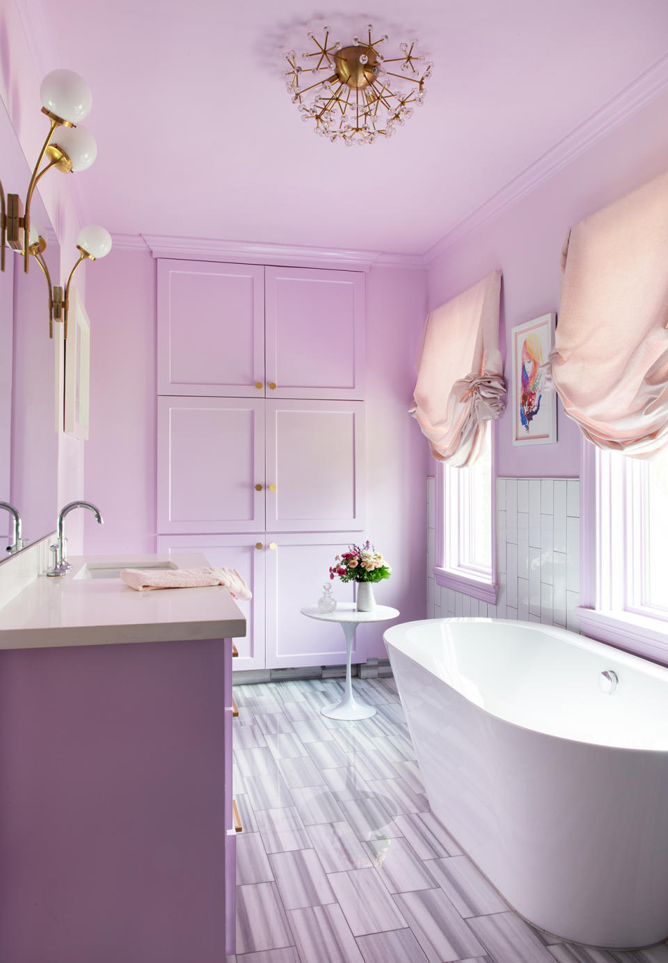
"Lavender is a wonderfully bright and youthful choice when designing for a teenager," says Los Angeles interior designer Sarah Barnard. The pastel hue in this bathroom feels floral, fresh, and fun, while contrasting white details, like the sleek tub and side table, add grown-up glam.
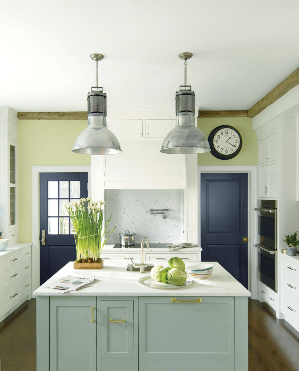
Using the color wheel is a surefire way to figure out which hues work well together. In this sunny kitchen, three analogous colors—medium green (Flora on cabinets), light green (Fernwood Green on walls), and blue-black (Witching Hour on the door), plus white—create harmony, says Hannah Yeo, color marketing and development manager for Benjamin Moore. "The room looks fresh and balanced," she says.
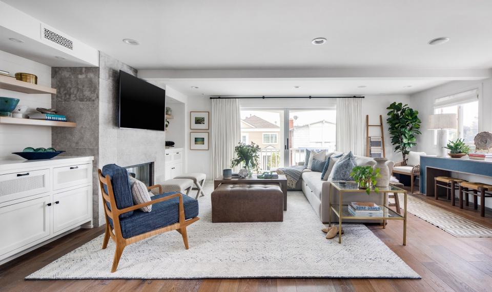
White, ever the classic neutral, pairs with blue to create a contemporary look in an expansive living room. "Our approach was all about light and bright, using white for the walls, draperies, and rug to create a beautiful backdrop to the colorful design," says Newport Beach, California, interior designer Denise Morrison. As a result, the blue chairs and table really stand out.
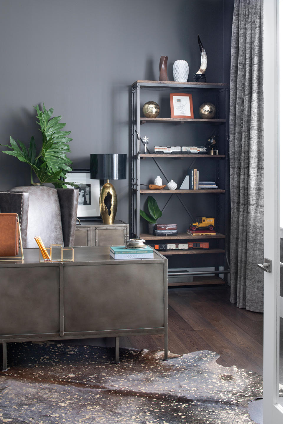
This contemporary office owes its cool vibe to walls painted Sherwin-Williams' Urbane Bronze, a rich brown that pairs well with gray and ivory. "We wanted the space to look industrial," says John McClain, who uses the brand's paints for his projects. "Using a dark color in a small space helps to create the feeling that it's enveloping you."

Decorate your wall with a stripe of paint at the top that continues onto the ceiling. This adds depth to the room and is a simple way to spice up your décor.

When guests open the powder room door, they'll think they've stepped into a sparking jewelry box. Every surface—walls, ceiling, door, and window trim—is painted with Benjamin Moore's Dark Purple so there's no delineation, which unifies the look and "enlarges" the small space. A high-gloss finish makes the room glisten; the white sink and gray door provide balance.
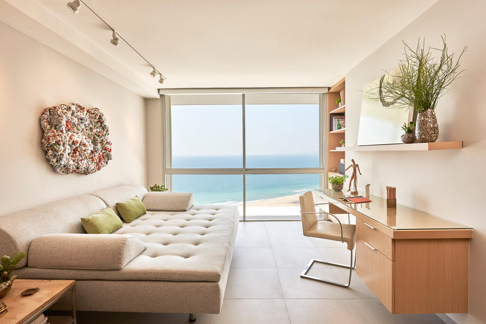
By using a sandy color palette, says Barnard, this airy space feels fully integrated with the room's focal point: the bright blue ocean framed by the windows. Green accents (pillows, plants) echo nature for a calming and inspiring space. Artwork by Renae Barnard adds pops of color.

Choose one wall as the focal point of the room and decorate it a different color than the rest. This is great a way to add dimension to your home—and the pop of color gives the space a welcoming look.

"This is a great way to use color in a teen's room," says Yeo. The walls are a soft blue by Benjamin Moore (Bird's Egg) with white trim and the charming set of drawers; their fronts are reminiscent of the colors of the ocean, and range from powder (Serenity) to dark blue (Clearest Ocean Blue). The painted white floor offers clean contrast—and mimics the palest-possible sand.

Want your bathroom to make an of-the-moment, but organic statement? Paint beadboard and batten in a bold green such as Valspar's Wilderness and add gold accents (look to the towel hooks and frames seen here). "Keep the rest of the room light and neutral and the green will really shine," says Harmon.

Rich, vibrant colors can work in a room that's in an otherwise neutral home, especially if the room is secluded. The library seen here uses three different shades from one color family: Benjamin Moore's blue (Lucerne) for the built-in bookshelves, a lighter iteration (Exhale) for the shelves' interiors, and a darker one (Soot) for the door. "Red accents bring the room together," says Yeo, "so it's not overly blue."
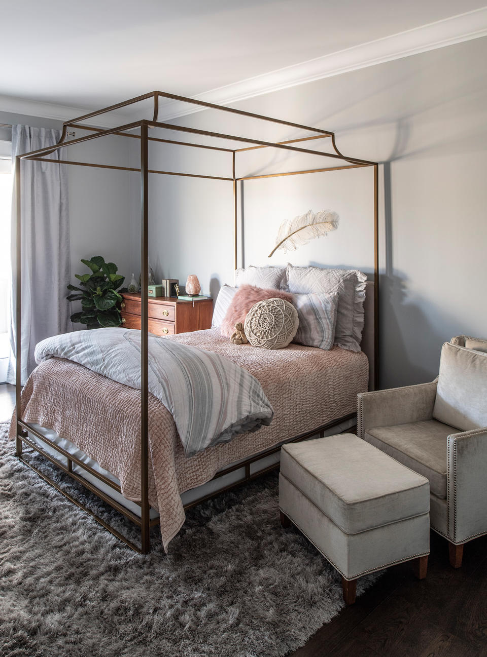
Layering color gives a room richness and depth. This bedroom, painted in Misty, a pale blue, offers the perfect base for more color, since it's so versatile. "Misty looks different in every environment we place it in," says McClain of the Sherwin-Williams hue. "Sometimes it has a green undertone, sometimes it's blue." Here, the shade is paired with bedding that's peachy-pink and gray, creating a pastel oasis.

Cabinets painted blue-green are this kitchen's lively focal point. The wood-and-gray hues ground the room keep the jewel tone from overwhelming the space. "When incorporating a lot of color, it's important to combine your designs with earthier tones to keep a space from looking too bright," says Morrison.
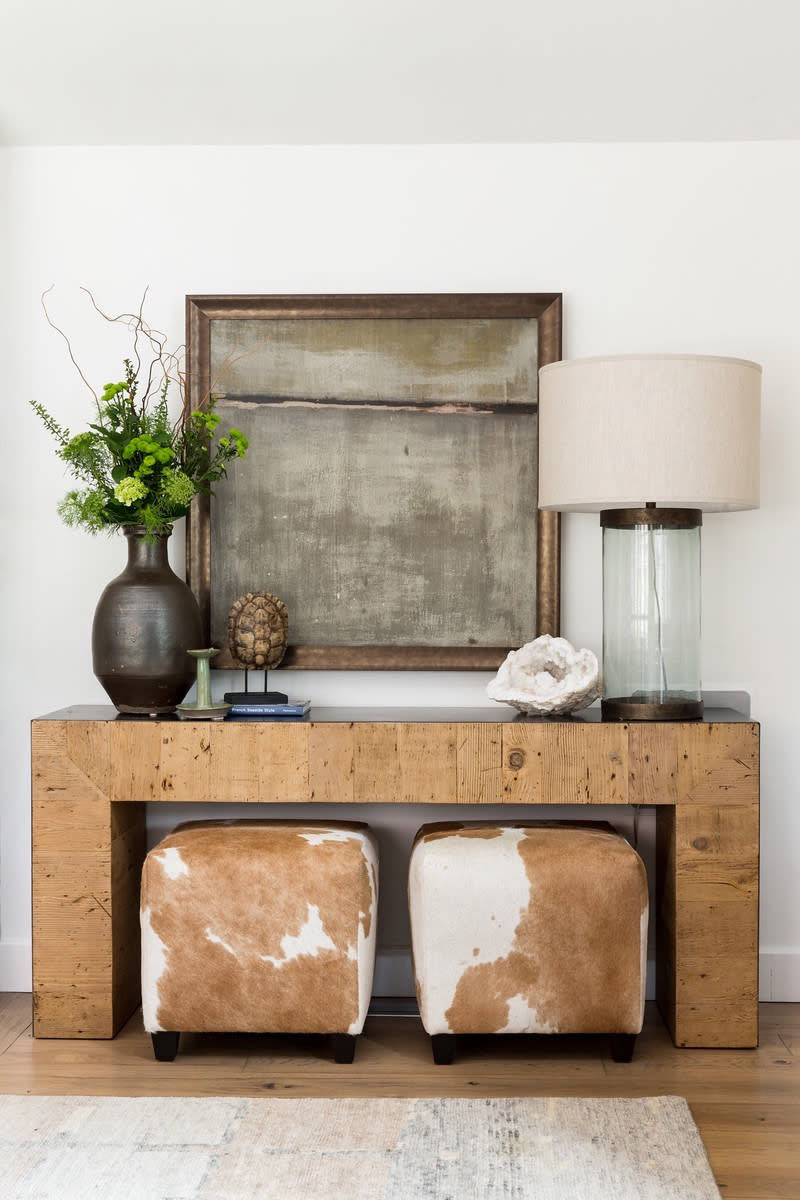
A gray-and-honey palette creates a warm, welcoming mood in this cozy bungalow's entryway. "The neutrals are an evolution from the all-gray palettes of recent years," explains Morrison. A rustic wood table and vase full of flowers add texture and keep this simple palette from falling flat.

This earthy bedroom is like an extension of the bountiful garden just beyond the French doors. Barnard used lighter and darker shades of green from the same color family on the walls, bedding, and draperies, which layers the look. A dark brown wood headboard and side table add warmth.
Tried-and-True Paint Palettes to Bookmark for Your Home
Experts share their favorite shade combinations for each of your house's many rooms.
Solve the daily Crossword