Top Designers Reveal Why Buttercream is the Summer's Most Sumptuous Neutral


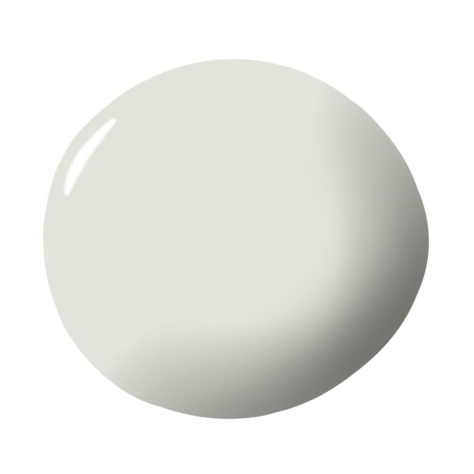
Top Designers Reveal Why Buttercream is the Summer's Most Sumptuous Neutral
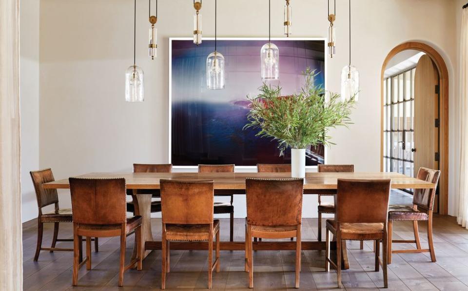
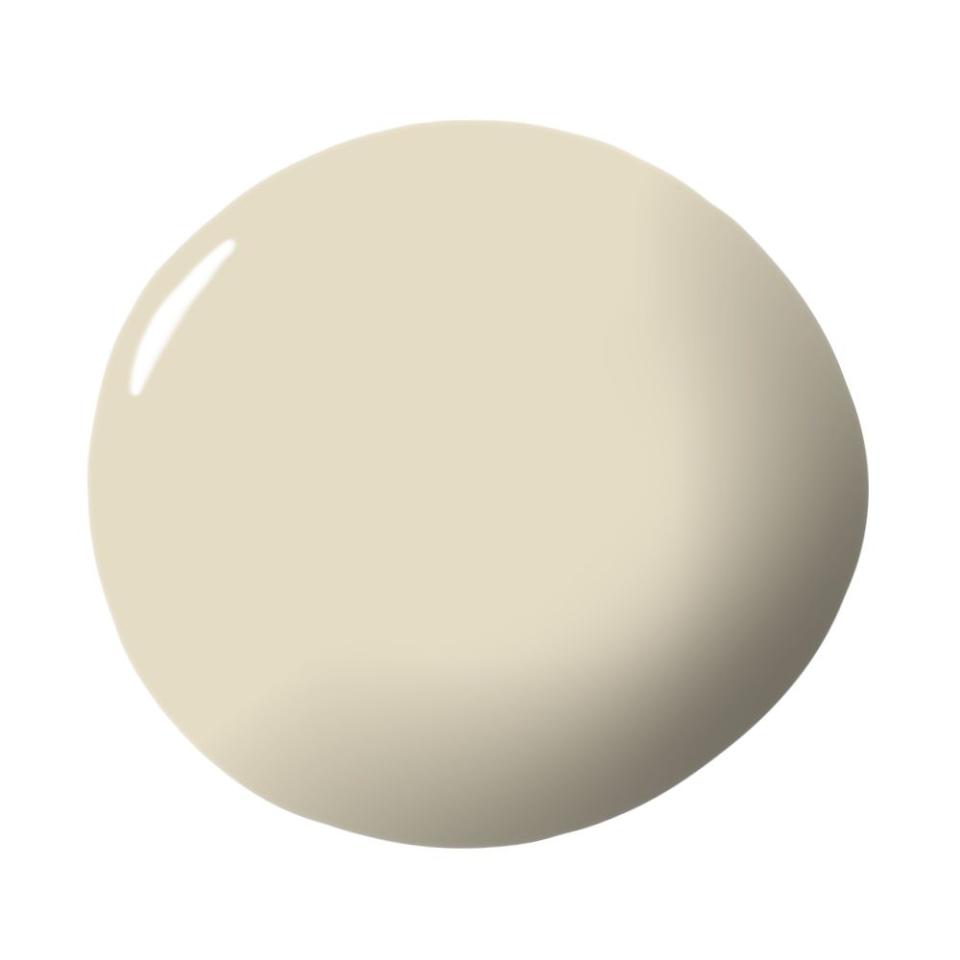
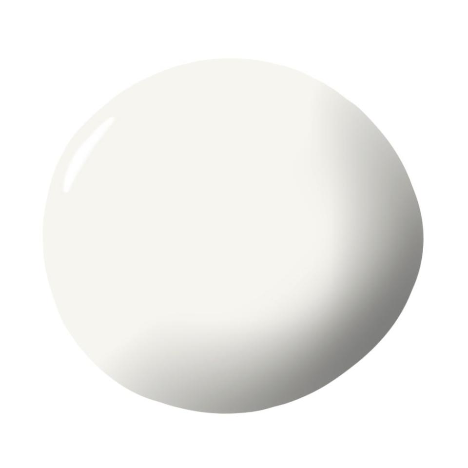
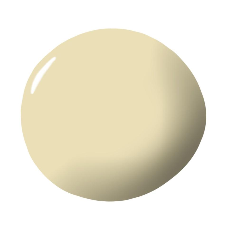
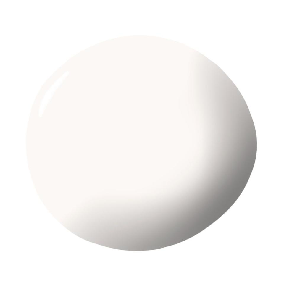
Smooth like butter, but striking enough to stand alone, buttercream paint is a foolproof hue. Not only is this mellow yellow an instant mood-booster, it’s incredibly cozy and a great backdrop to both bold and neutral shades. “Delicious is the first word that comes to mind when I think of buttercream paint,” says Leatrice Eiseman, Executive Director of Pantone Color Institute. “Our studies reveal that people invariably have a positive reaction to the color as it is seen as soft, warm, touchable, and comforting, and it is often associated with the sense of taste (as in delicious)!” A neutral that won’t fade into the background, buttercream is a fun alternative to your classic beiges and creams. “It is unobtrusive and subtle, a relaxed, quiet presence,” Pressman adds.
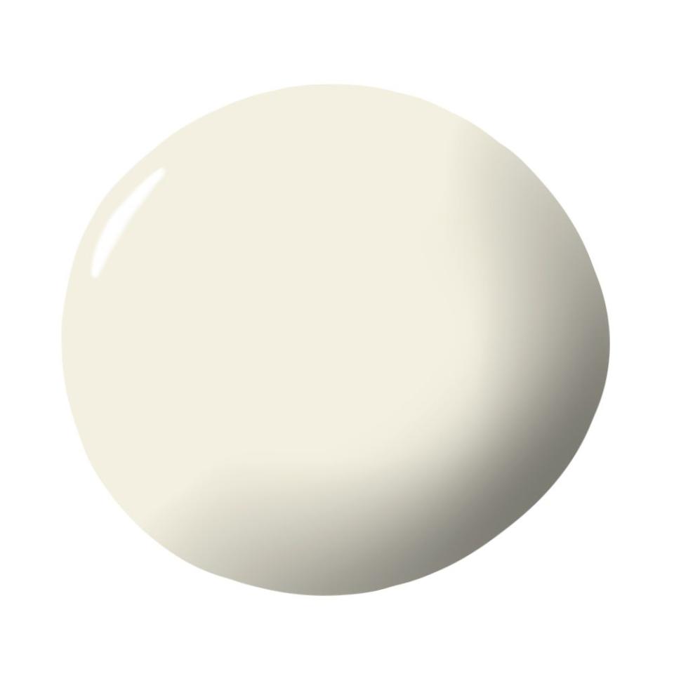
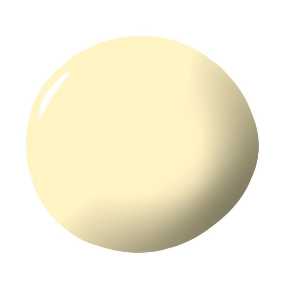
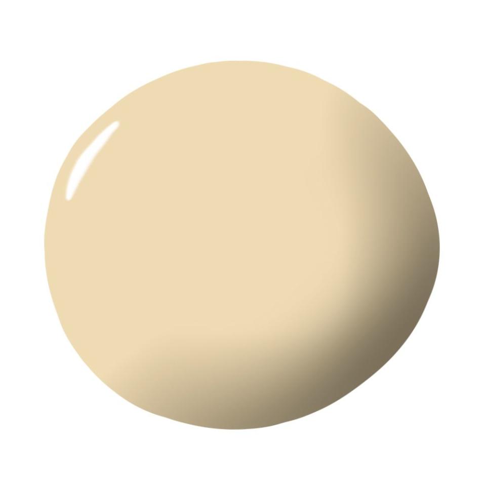
If you’re ready to indulge in the summer’s most sumptuous neutral, check out the best buttercream paint colors that top designers swear by.
A color that sounds as enticing as it looks.