There's a new color trend minimalists love, and here are 6 ways designers have used it to create calm and soothing rooms

MInimalism has been evolving into a decor style that is so much warmer than it used to. It's no longer about a lack of stuff, but about a edit of only what you love - an apporach the Livingetc team has coined as minimaluxe. And as the look changes, so has it's use of color, folding in richer, earthier tones. Specifically green.
Green comes in many shapes and sizes. From dark moss and deep olive to verdant chartreuse, vivid lime, and soft mint – the possibilities of this biophilic hue are endless. Mother Nature’s color of choice has often been praised for its ability to work well as both a statement and a neutral, seamlessly grounding interiors as well as elevating them. Plus there are so many other colors that go with green, making it a versatile choice.
As it grows in popularity, green continues to be featured in more minimal designs. These are interiors that don’t shout but feel cool and almost effortless in their use of green.
The new minimalist ways to use green
To explore how best to use this invigorating shade with a minimalistic approach, we’ve spoken to interior designers for their expert advice. This selection offers inspiration as well as insight to help you find your perfect green.
1. Pair with warm neutrals

Softer hues of green blend beautifully with neutral and warm tones like cream, beige and peach as shown in this delightful and calming scene. Imagined and realized by AFTERBACH Studio for their Dauphine Project, the green architrave works well to introduce each chapter of this Parisian apartment.
“A green khaki palette color was used contextually on this project to make a link with the Seine River located just inside the historic Parisian building,” said Francesco Balzano and Jessica Barouch from Paris-based studio, AFTERBACH.
This highlights a key point when using green in a minimalist way which is connecting your color choice to the surroundings of your space. Not only does it allow the interior to feel more holistic, but it encourages interaction with the greenery that sits outside the window.
The duo also shared their advice for working with green and encourage you to focus on creating a minimal contrast with other colors.
“Green can be used in contrast with a light ivory color, and it is interesting to play with a camaieu of green to create vibration and variation: like a music partition,” Francesco and Jessica Barouch added.

GET THE LOOK: Whirlybird modern state emulsion
Works with: creams, ivory and beiges
Perfect in: west or north facing rooms
2. Use green on one piece of furniture

There is nothing quite like a green sofa, especially in this hypnotic olive hue pictured in Milanese and South Korean design duo Gori & Yoon’s Lovanio apartment design. The green doesn’t feel like it’s weighing down the composition but instead builds on the warmth of the natural tones and textures found around the room. This curated palette was key to the design as confirmed by the designers.
“The use of colors, the touch of green of the sofa gives elegance to the composition,” said architects Elisa Gori and Jaehyun Yoon of this minimaluxe living room.
“In addition, the green color is used in a minimal, punctual way, in fact, characterizes a single element that is almost the protagonist of the space, the round sofa of the main room, so that the result is just a touch of color that recalls nature,” added Elisa and Jaehyun.
Further emphasizing how green can function as an independent yet cohesive feature within minimalist schemes, embedding elegance and interest into the room.

GET THE LOOK - Mod sofa
Price: $3410
Size: 31'' H X 105'' W X 40'' D
3. Wrap a soothing green around a room

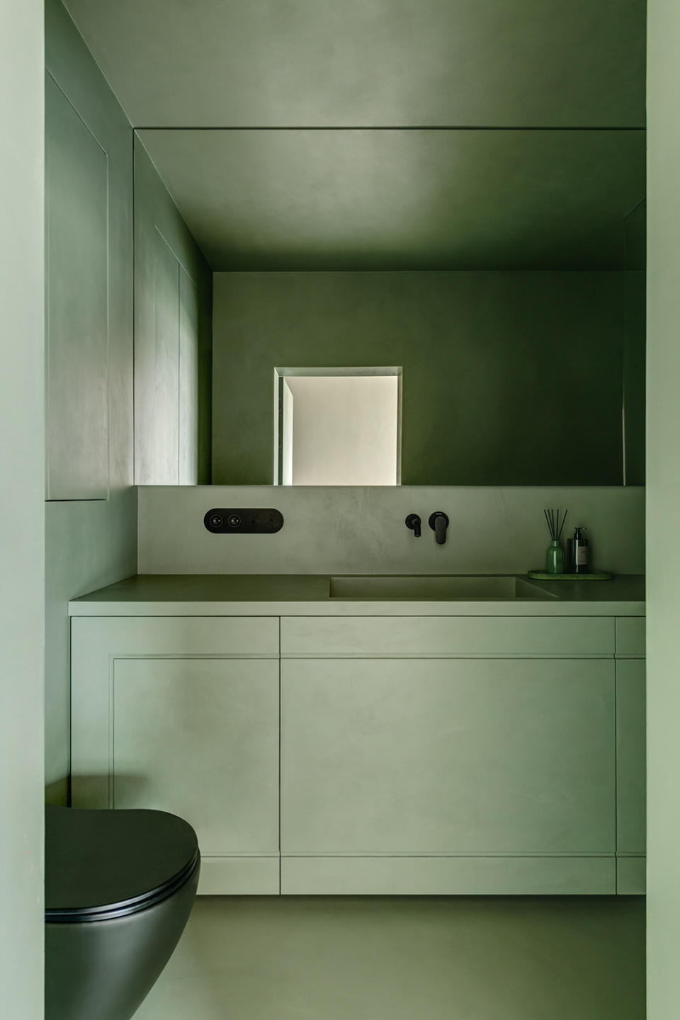
A cool and soothing choice, mint green is a great way to create an escape within your minimalist bathroom. Mint is a great foundation for other darker accents as well and is a great color for monochromatic schemes. As demonstrated by Warsaw-based design studio Dawid Konieczny Interiors.
His enveloping use of green for this Grzybowska Apartment project highlights how serene of a choice green can be. “I wanted to significantly emphasize the space for relaxation, a kind of oasis. Green makes the feeling of relaxation stronger, so it is very important not to use other dominant colors. In this project, I combined noble green with black accessories that perfectly harmonize and add extra nobility. Additionally, covering all surfaces with green micro-cement optically enlarged the bathroom,” says Dawid Konieczny says.
His advice for minimalistic green schemes focuses on using green with complimentary tones, be it in private or public spaces but he also advocates the reliable results of monochromatic designs. “I suggest using the total green look option, it will be totally minimalistic, safe, and will certainly look good,” he adds.
4. Look for dark tones

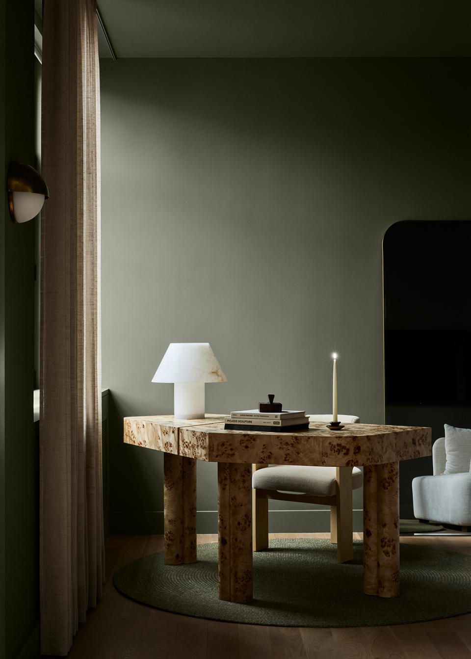
Home office inspiration comes in the form of this charming design by London-based studio, Banda. The dusky olive hue feels inviting and serves as the perfect backdrop for the sculptural desk and lighting. Banda’s design studio explained their intentions for the space and how the minimal green works in harmony with the rest of the apartment.
“This wonderful olive color is ‘Rooftop Garden’ by Benjamin Moore. Its dark, muted tones provide enveloping privacy for this studious work area which provides a striking contrast to the light and sociable free-flow areas of the apartment,” says Edoardo Mapelli Mozzi, founder of Banda.
5. Add in green veining

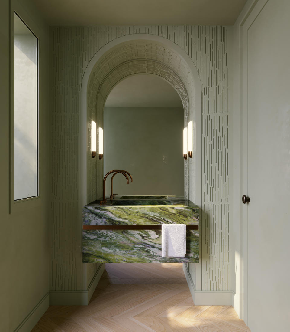
Powder room moments are made even more special with pistachio green, as shown in this Long Island Renovation project by New-York based designer, Marianna Fiorin. The softer hues of green work to frame the centerpiece of the room, a verdant green marble basin.
“For this powder room, we decided to enhance this concept with a total green look. Facing the back garden, the room has a vanity in Irish Green marble, a powerful stone, the starting element in our design. We decided to keep the entire room green and add an unexpected texture to the arched structure, to make it original, keeping a soothing feeling,” says Marianna Fiorin of Marianna Fiorin Interiors.
Her advice for minimal schemes with green references the importance of understanding your material palette and selecting natural sources of green.
“My advice for using a total green look in interior, is to start from a first material selection, which can be stone, painted wood, a back painted glass, for example, or whatever you are attracted to,” she says.
6. be inspired by nature

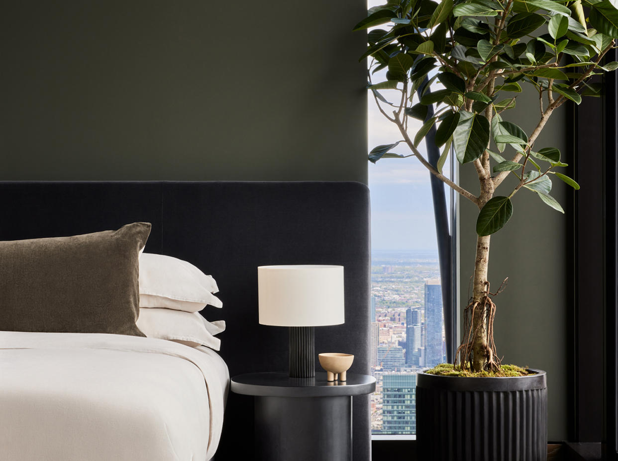
A forest in the sky comes to life in this New York penthouse bedroom designed by Banda. By cleverly pairing the fresh Rooftop Garden paint by Benjamin Moore with elegant black joinery and furniture, a sophisticated interior emerges that feels both contemporary and classic. This is a distinctly different scene than Banda’s sage-like home office mentioned earlier, proving that one shade of green can have many lives.
“This rich green hue is so versatile; we have also used it in the secondary bedroom of this Banda Penthouse in the iconic 111W57 building in New York to anchor the design to the dynamic visual theatre of the Central Park view. We wanted a palette with tones that would work with both the park and the cityscape beyond, without detracting or trying to compete with the extraordinary views,” says Edoardo Mapelli Mozzi, founder of Banda Design Studio.
The designers highlight that the secret to finding the right shade of green lies in not just the narrative of the interior but also focuses on the story of the exterior, whether it be surrounding landmarks, architecture, or nature. Our guide to the most elegant green accessories will inspire you, too.
