The Best Paint Colors for Your Home Office
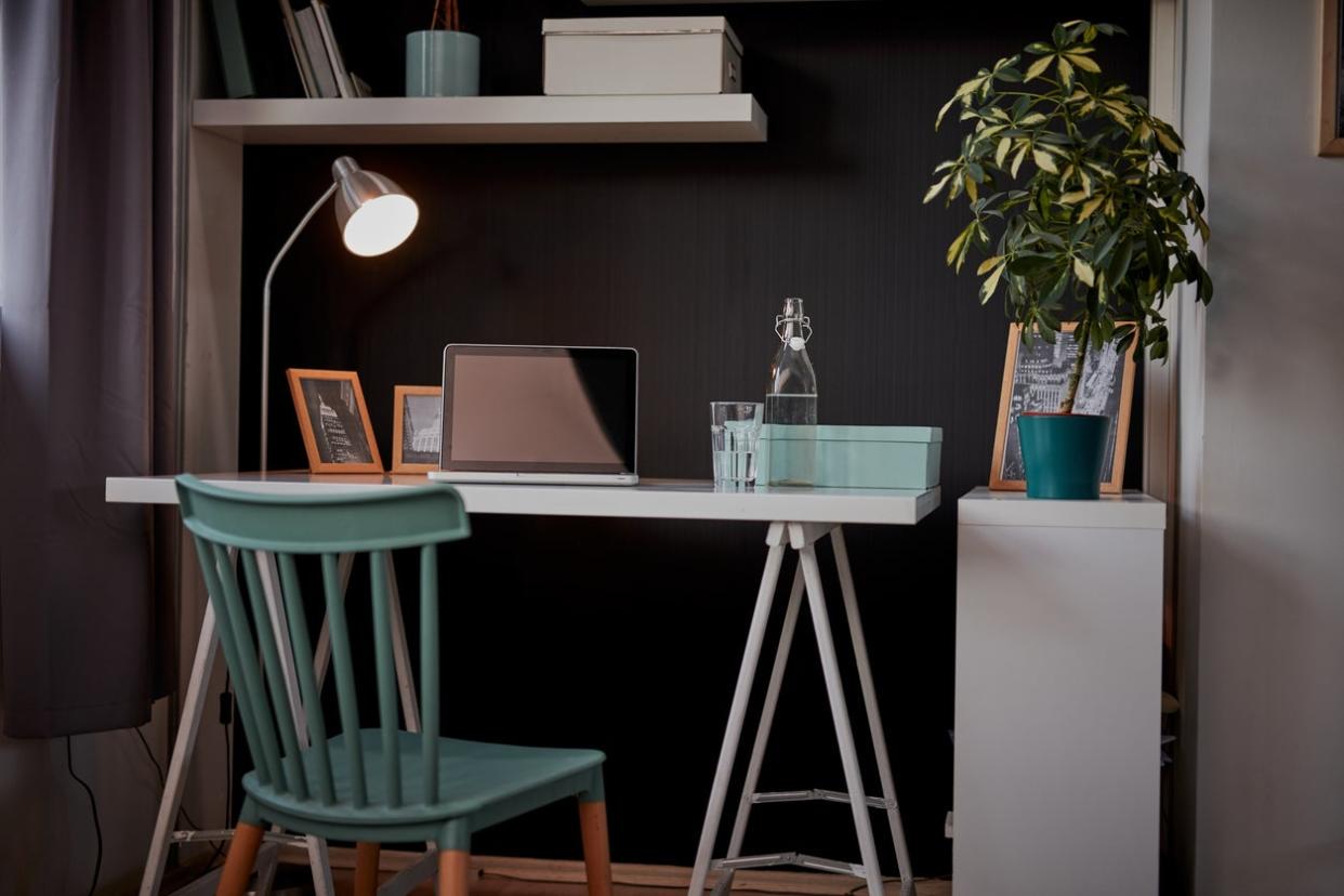
Working from home has its benefits: No commute. More time with family. No dress code. But then there are the drawbacks: interruptions, distractions, lack of interaction with colleagues, and maybe even a less-than-ideal work space. When you're working from home, you need to do everything you can to enhance your focus, productivity, and, possibly, your patience. Paint can help.
The color of the walls in your work space is about more than just aesthetics. “Beyond practicality, having this space feel joyous and personalized can add more pleasure to the daily work experience,” says Sarah Barnard, founder and lead designer of Santa Monica-based Sarah Barnard Design.
Whether your goal for the office is to be all business, all chill, or creativity central, there’s a paint color out there that will help you achieve it. Consider these stunning shades as you update your home workspace.
Watery by Behr
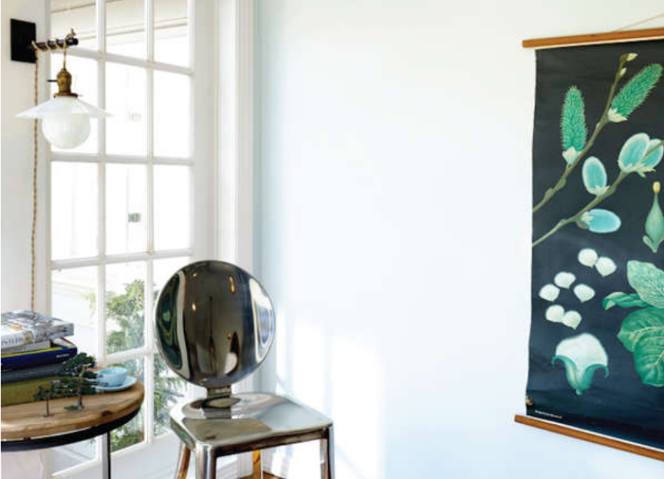
Photo: Behr
Blue infuses a room with peace and calm, plus it helps to stimulate the mind. Cool blue tones help with focus and promote productivity. Tax preparers, actuaries, clerks, and auditors can benefit from working while surrounded by blue. Watery by Behr (HDC-CT-26) may bring to mind that beach vacation you’re working toward, but it will also help keep you on task.
Council Bluff by Pratt & Lambert

Photo: Pratt & Lambert
Gray is the on-trend neutral of the moment, and provides a blank canvas on which to project your unique design style—or not, if you prefer a minimalist work vibe. Are you trying to project an “I’m organized, dependable and can get the job done” vibe to your clients? Council Bluff by Pratt & Lambert (408C) is a great choice.
Million Dollar Red by Benjamin Moore
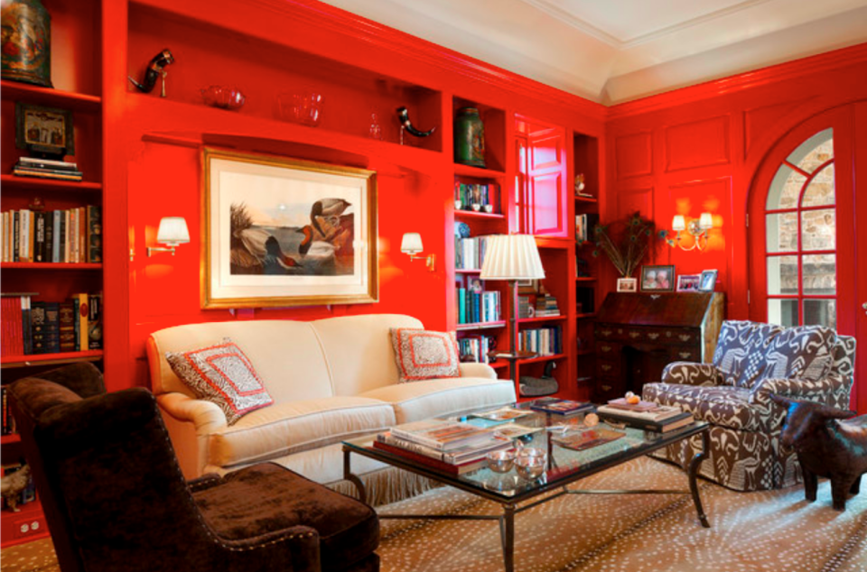
Photo: Designer | Archer & Buchanan Architecture; Photographer | Tom Crane
Red is the color of vitality and passion; it promotes action, and stirs up excitement. If you’re in an industry that involves frequent collaboration or hosting clients, Million Dollar Red by Benjamin Moore (2003-10) will make a lasting impression. It's also an excellent accent color if you're trying to accentuate a feature in the office, like a library wall or an under-stairs nook.
PRO TIP
“Brighter, more saturated colors can be a great way to enliven a home office space. Using colors that may be more independent from the palettes in other home spaces can also help create an emotional division, helping to establish a bit more work/life balance.”
—Sarah Barnard, founder and lead designer of Sarah Barnard Design in Santa Monica, California
Secret Meadow by Behr
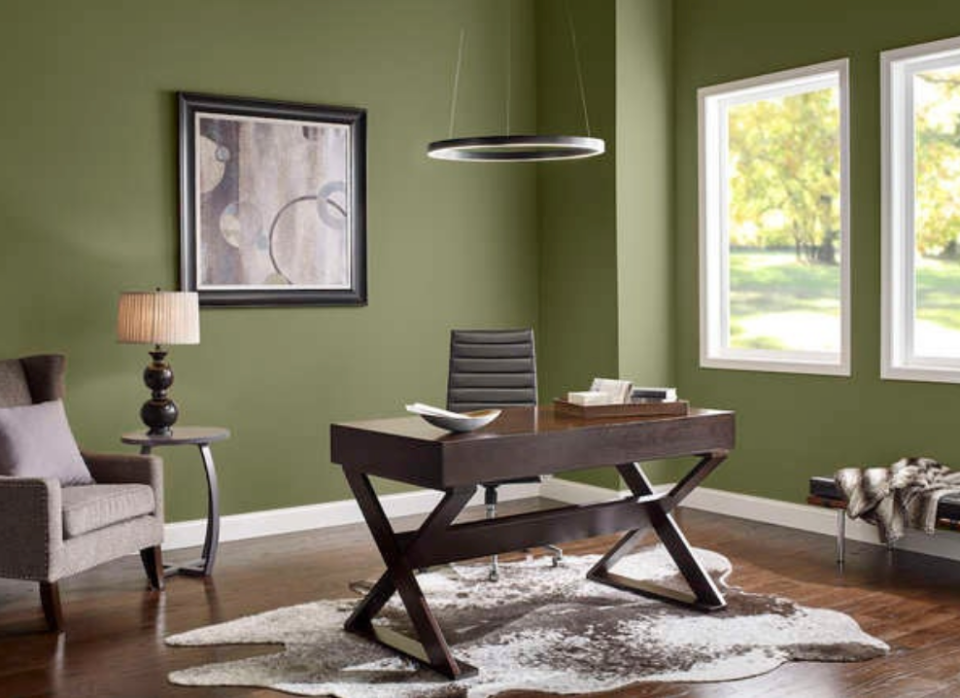
Photo: Behr
Green is tranquil. It reduces eye strain and improves work efficiency. If you work long hours or perform repetitive tasks, green is one of our go-to choices. Behr’s Secret Meadow (S360-6) is a full-flavored green with natural tones of foliage, lichen, and moss. This is an outstanding choice for an overall calming effect.
“Green and blue are both known for being wonderful options in the workplace.” explains Barnard. “Because these colors are strongly connected to the earth, they may feel calming while energizing enough to foster creativity.”
Blue Danube by Benjamin Moore
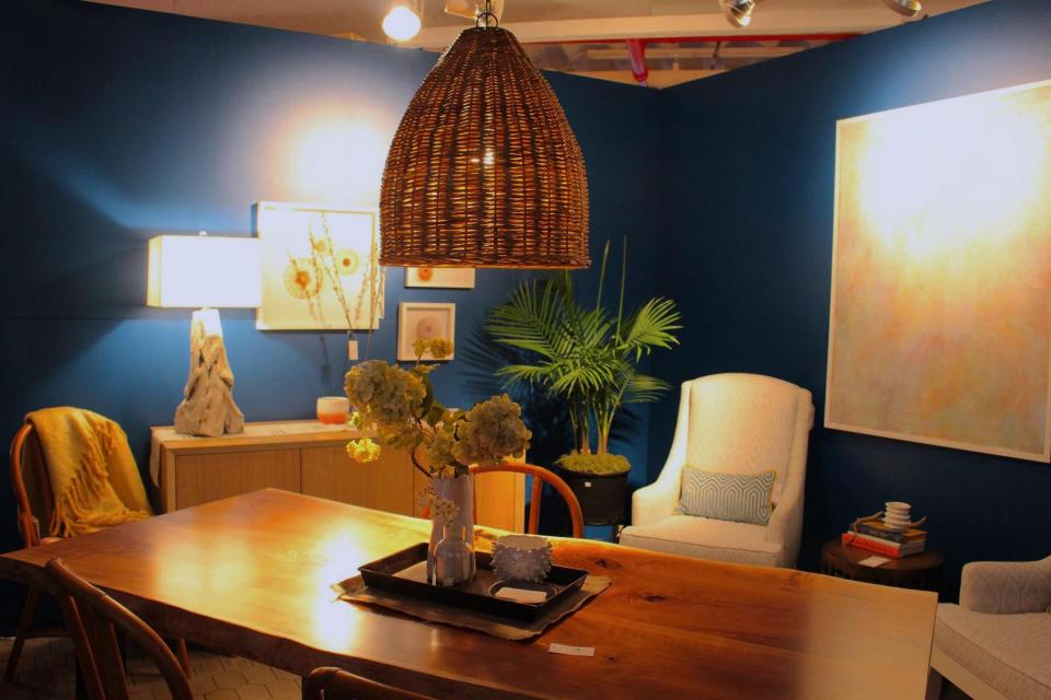
Photo: Benjamin Moore
New to working at home? Blue could be right for you—think clear blue skies and calm blue water. Blue Danube by Benjamin Moore (2062-30) is a cool blue that can lend calm and focus to a large, open space. Paint the whole room, or use Blue Danube for an accent wall or door.
Downing Sand by Sherwin-Williams
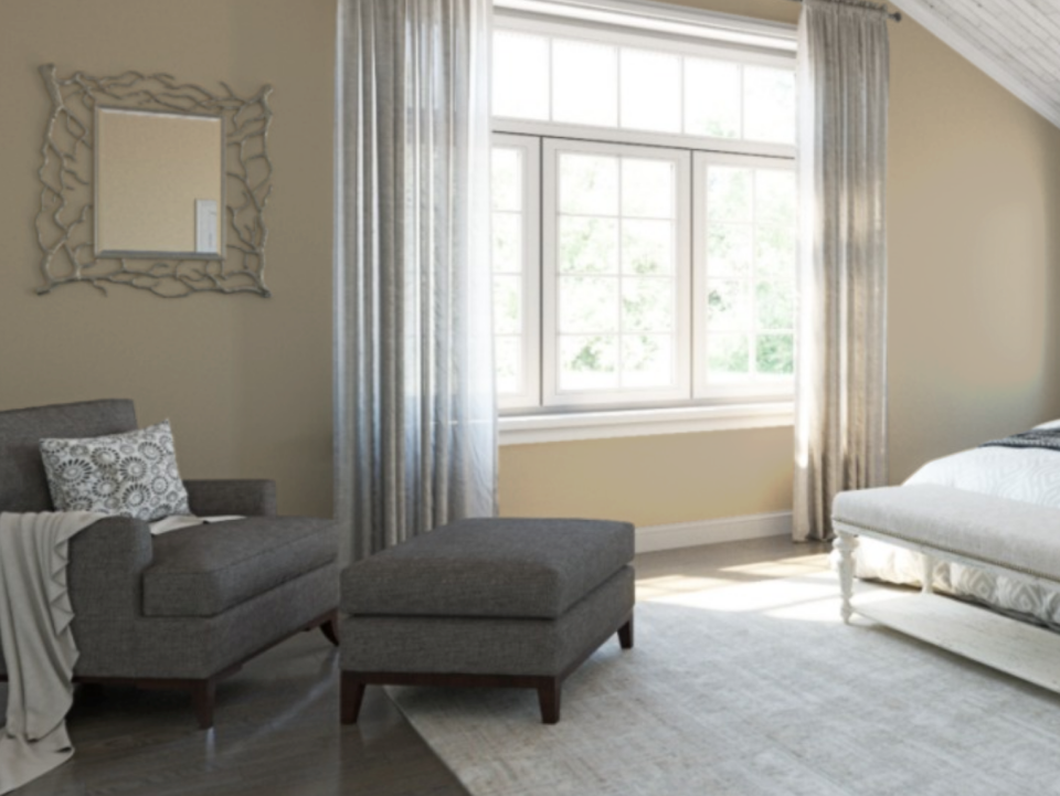
Photo: Sherwin-Williams
Greige is a great shade for multiuse spaces, however large or small. If your home office is sandwiched in a corner of the family room, a color like Sherwin-Williams’ Downing Sand (SW 2822) provides a buttoned-up, neutral backdrop for corporate video calls, but is stylish enough to go with your mod living room decor.
RELATED: The Best Greige Paint Colors for a Warm, Welcoming Home
Rosemary by Sherwin-Williams

Photo: Sherwin-Williams
The earthy undertones of Sherwin-Williams’ Rosemary (SW 6187) cultivate a harmonious, one-with-nature atmosphere in any workspace. This is another great shade for those who have to appear on camera while working. “If you’re looking for a slightly more lively option, earth tones can offer more depth and saturation without being too busy or distracting,” Barnard said. Whether you use Rosemary as an accent wall or for the entire room, it’s bound to transform your office into a space where inspiration happens organically.
Plum Suede by Magnolia
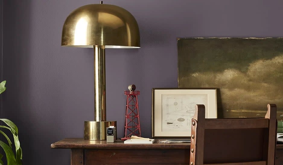
Photo: Magnolia
Deep purple is an often overlooked paint color for home interiors, but as this space shows, it can make a unique and stylish addition to your space. With the right shade, like Plum Suede by Magnolia, this color can create a cozy and meditative atmosphere, ideal for focused work!
Inkwell by Sherwin-Williams
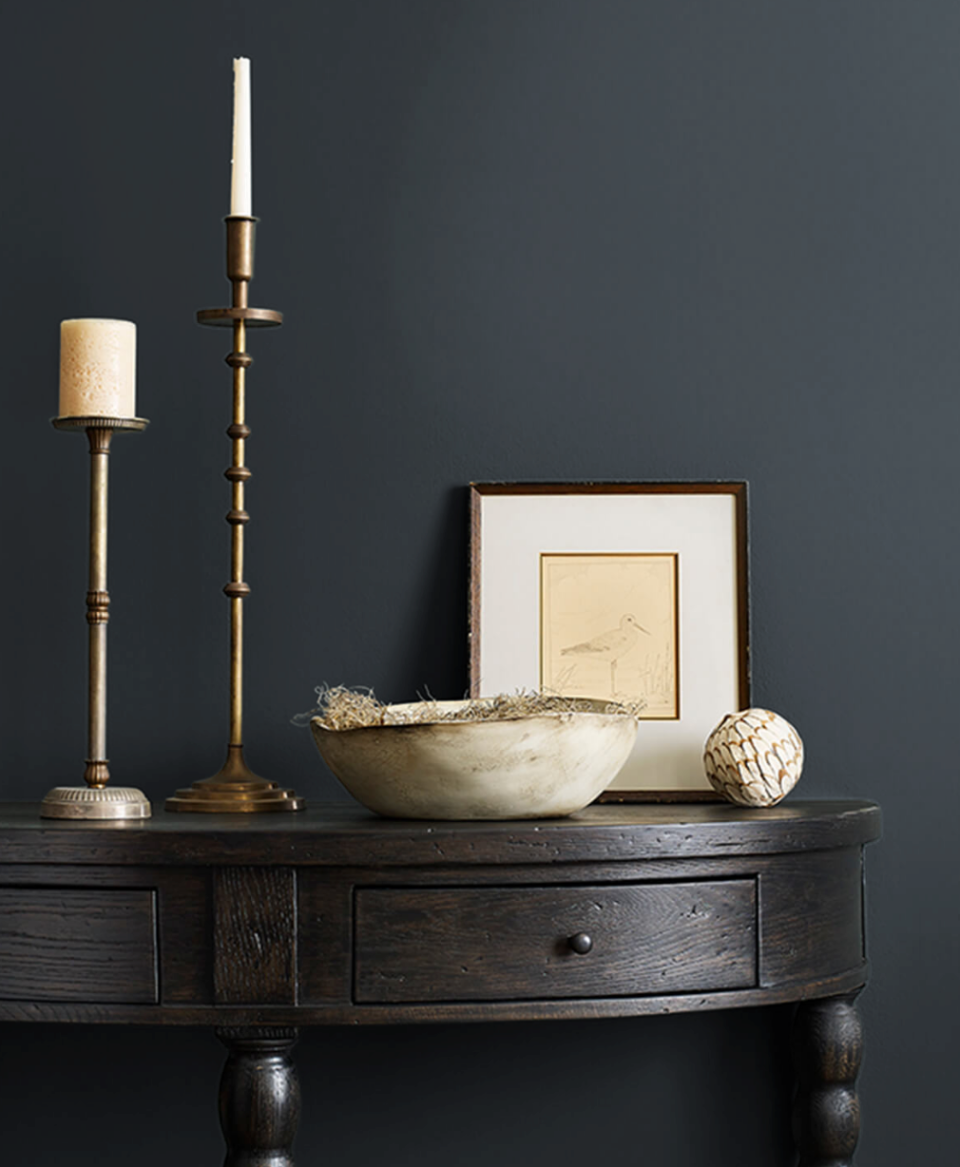
Photo: Sherwin-Williams
While black can be an intimidating choice for an interior space, its deep hue creates a moody yet inviting atmosphere for any room. Case in point: Inkwell by Sherwin Williams (SW 6992). This black paint has a hint of blue that creates a dark and cozy ambiance, perfect for minimizing distractions and enhancing concentration.
Silver Sage by PPG
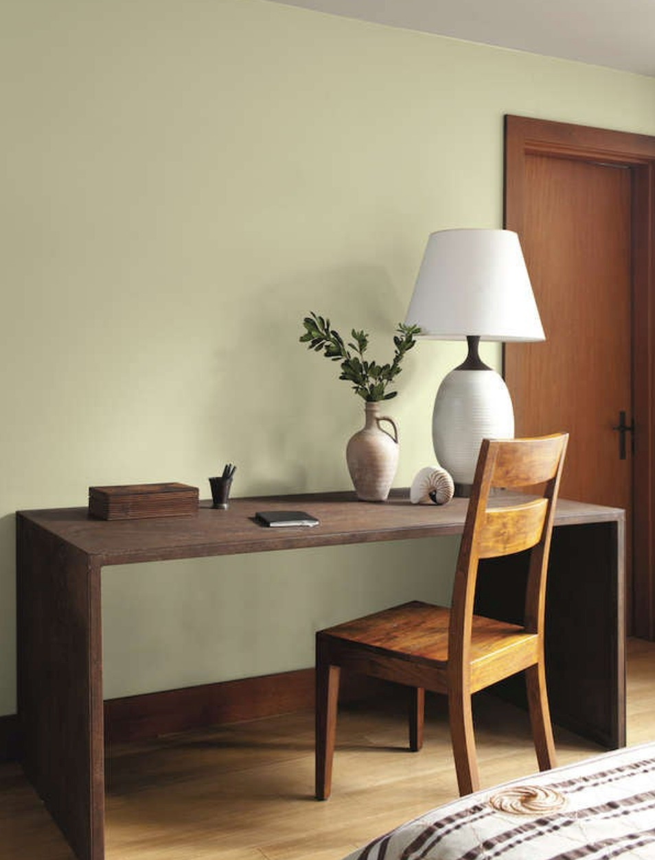
Photo: PPG Paints
Gray walls create a lighter, more open impression in spaces with little natural light. Silver Sage by PPG (PPG1113-2), a lightly green-toned gray, combines the calming effect of green with the airiness of gray. This is an especially good pick for small home spaces as it can visually open up a small room and make it feel more spacious and less cramped.
Surfboard Yellow by Behr
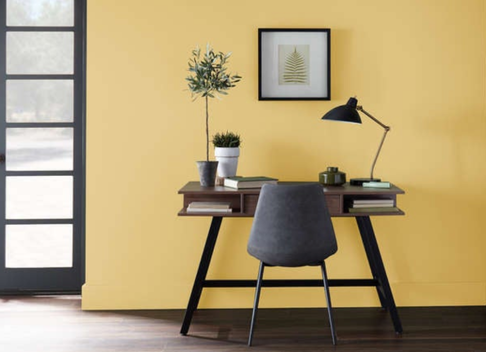
Photo: Behr
Yellow stimulates creativity, excitement, and innovation. Designers, writers, artists, and engineers benefit from a healthy dose of yellow in the office. Surfboard Yellow by Behr (P280-4), a bright and cheerful shade, works well for an entire room or as an accent color.
Yellow is a stimulating shade, certainly, but it may not be the right way to go for those who work for conservative employers. Why? “Creative fields may be more welcoming toward brighter colors or more elaborate backgrounds, while those same tones may be more distracting in a more traditional professional environment,” Barnard explains. “When in doubt, neutral tones can offer the most versatility.”
Mascarpone by Benjamin Moore
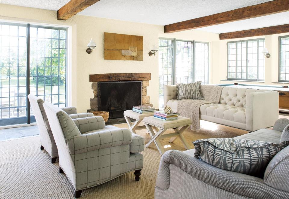
Photo: Benjamin Moore
White makes a space feel open, clean, and spacious, so it's a good choice for making a small room feel larger. Mascarpone by Benjamin Moore (AF-20) is a soft, creamy shade that brightens a dark room without looking too antiseptic, and establishes an easy neutral background for decorating. If you go with white walls, bring in plenty of color with artwork, rugs, and other accessories.
RELATED: 19 Rooms That Prove Beige Isn’t Boring
Ebb Tide by Pratt & Lambert
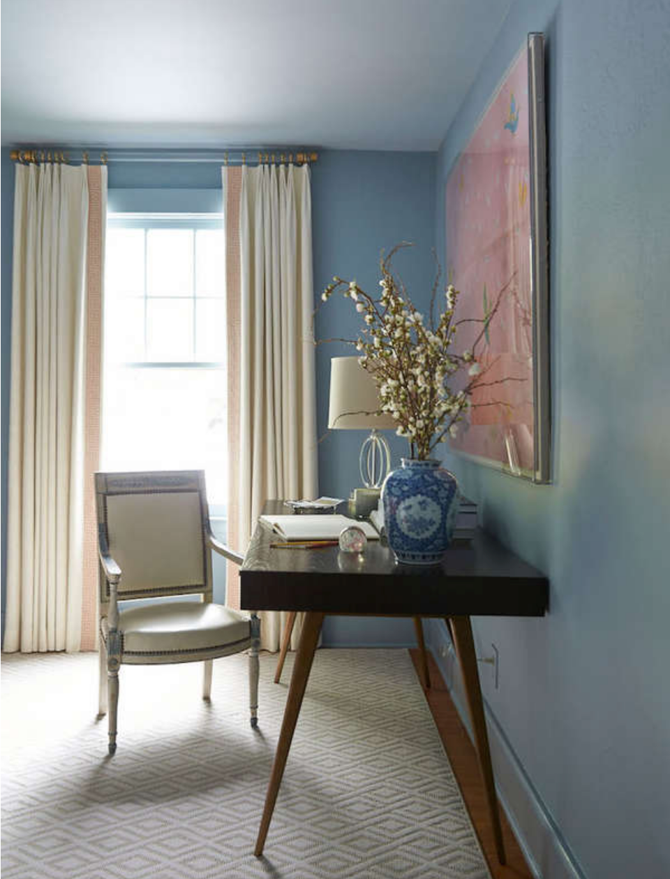
Photo: Pratt & Lambert
Blue helps to evoke feelings of peace and security, which may make Ebb Tide by Pratt & Lambert (311D) an especially appealing paint choice for those who are constantly under crushing deadlines. This color softens the ambiance of a room (and may soften your mood), while projecting a sophisticated vibe.
RELATED: 11 Paint Colors Designers Pick for Their Own Homes
Rain Drop by PPG
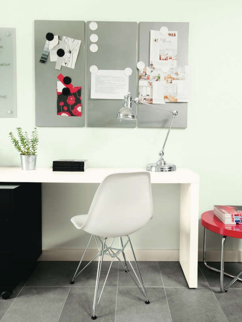
Photo: PPG Paints
Blue can work like gray, only with more charisma. Case in point: Rain Drop by PPG (PPG1145-1), a soft and tranquil shade of green. This is a great color choice for those who work in creative professions such as graphic design or writing. In fact, research published in the Personality and Social Psychology Bulletin suggests that green can boost creative productivity. Who are we to argue with science?
Golden Opportunity by PPG
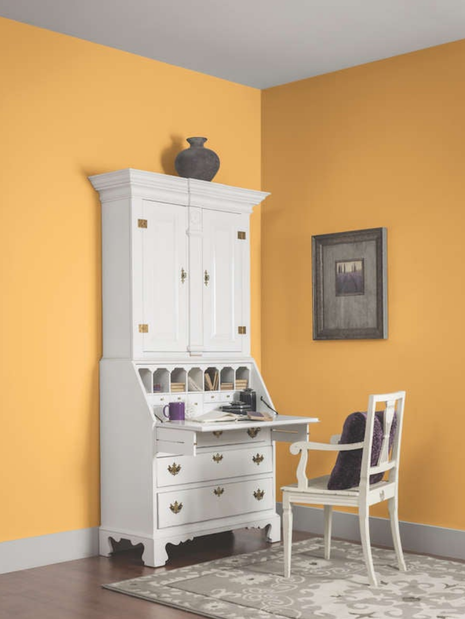
Photo: PPG Paints
The solution to rainy days and long winters, Golden Opportunity by PPG (PPG1204-6) brings the benefits of both yellow and red to the home office. The color stimulates energy, optimism, creativity, and passion. A rich golden accent wall may be just what you need to beat the Monday blues!
RELATED: 9 Paint Color Trends You Might Regret
Chocolate Candy Brown by Benjamin Moore
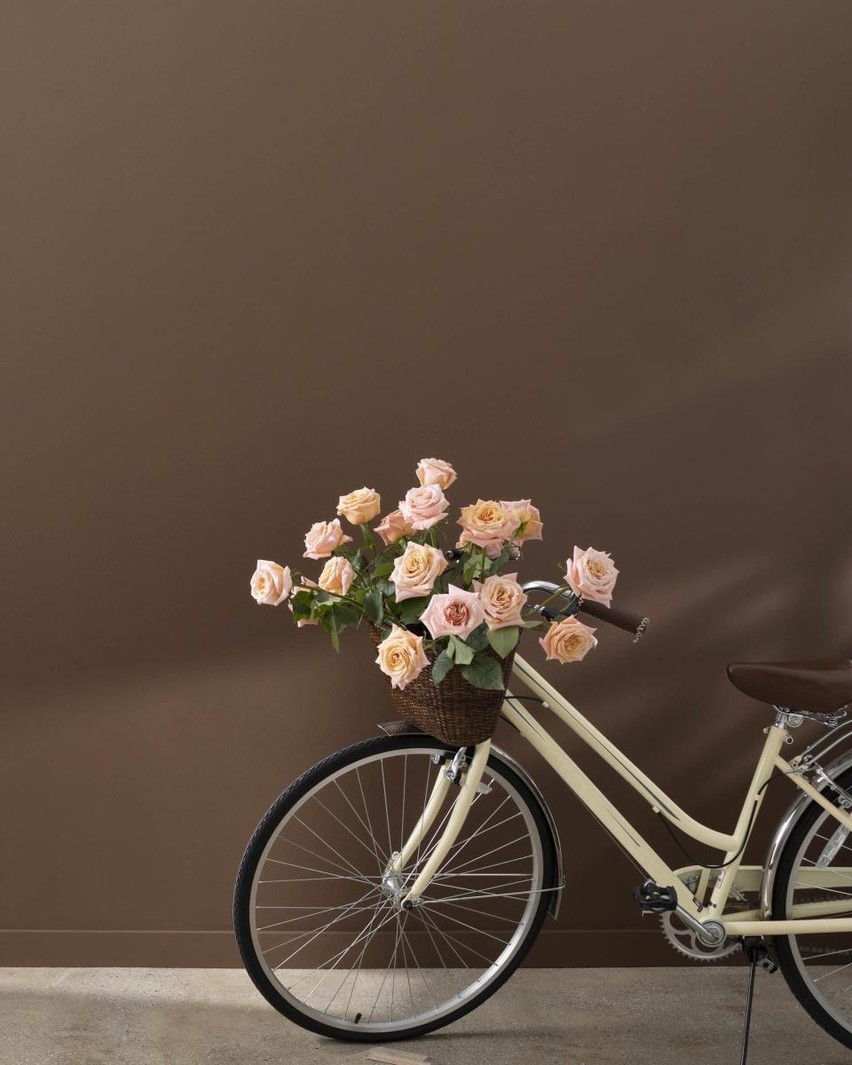
Photo: Benjamin Moore
The rich, deep brown hue of Chocolate Candy Brown by Benjamin Moore (2107-10) is all about warmth and sophistication. Chocolate tones are relatively rare in home interiors, which makes this color a bold choice that will clearly delineate your work zone from your home space.
Naturel by Sherwin-Williams
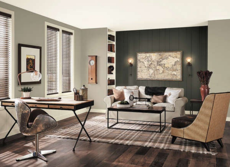
Photo: Sherwin-Williams
Gray can be cool, neutral, or cozy. The warm undertones of Naturel by Sherwin Williams (SW 7542) give a room a crisp look without seeming stark. It's just right for making an open space feel comfortable. Additionally, if your job involves looking at screens for long periods of time, according to Barnard, warmer paint colors can offer a bit of contrast and calm when giving your eyes a quiet place to rest. Add colorful furniture and artwork to change the mood.
Where to Shop All of The Paint Colors Above
Buy HGTV Home by Sherwin-Williams paint at Lowe’s
Buy Benjamin Moore paint at Ace Hardware
Buy Behr paint at The Home Depot
Buy Pratt & Lambert paint at Pratt & Lambert
Buy PPG paint at The Home Depot
Buy Magnolia paint at Ace Hardware
