What is the best carpet color for 2024? Top designers agree on one tone and it makes rooms look so rich and warm

Wall-to-wall carpets continue to climb back into the good books of interior designers and homeowners alike this year. Praised for their ability to inject warmth, texture, and color into schemes, carpets are eschewing their 70s-stained reputations for newer beginnings. We spoke to interior designers and experts from across the globe to ask which tones would take the lead in the coming year.
The consensus on new carpet trends proved to be clearly in favor of fiery tones like enticing maroon and inviting terracotta. Considering the shift towards maximalist designs and more experimental uses of color we’ve seen over the last few years; these shades feel both familiar and new. The superpower of these orange and red tones lies in their ability to work as versatile neutrals and striking statements.
1. Ruby red

Red is an undoubtedly bold hue that seems like an overwhelming option for a wall-to-wall carpet but can be incredibly inviting and enigmatic. A theory that is proven by Australian designer, Greg Natale with his sumptuous Darlinghurst Apartment.
“This is the latest incarnation of our apartment. We got the idea to use deep maroon carpets while in Paris. We couldn’t help but notice these indulgent, dark crimson carpets everywhere. My partner, Jason, suggested we do something similar in our home, which created the perfect backdrop for us to build on. The maroon carpet combined with maroon-painted walls was a choice inspired by Studio 54 and other icons of the disco era. It gives the apartment a dramatic, immersive effect that invites you into the space in an unforgettable way,” says Greg Natale.
These thoughts are echoed by other designers too like Oakland-based studio, Ike Baker Velten who agreed with Greg on what carpet types we'll be seeing. “In 2024 we are seeing red. But in a good way! More specifically, ruby red,” says Patty Cassidy, Director of Interiors at Ike Baker Velten.
The key is to see the red as an ingredient in the room rather than the entirety of the space. Not only will the red energize the furniture and objects around it, but it will also enliven the experience for you too.
2. Orange

Filled with optimism, orange is one of the best carpet colors to go wall-to-wall with. It can bring a touch of fun to your interior scheme. Opting for a geometric print allows you to cleverly combine the intrigue of orange with the versatility of a neutral, as pictured in this colorful interior featuring London-based experts, Riviere Rugs.
Creators of fine and hand-woven carpets and rugs, Riviere Rugs has also seen a more experimental approach to color from clients. “People are wanting to play more with color in the home with more focus on warm earthy greens, copper rusts, eggplant, and cerulean blue tones,” says Eleanor Dykes from Riviere Rugs.
In practice, remember to think about the big picture when designing your space and choosing your color. “It’s important to look at everything holistically as carpets are such a key piece in the room to bring a scheme and space together,” she adds.
Wall-to-wall carpets are a permanent feature, which emphasizes the importance of making the right choice when choosing your color, “they are made to last for decades to come so it’s important to really think about what you love that works for the space in the long term,” Eleanor concludes.
3. Rust

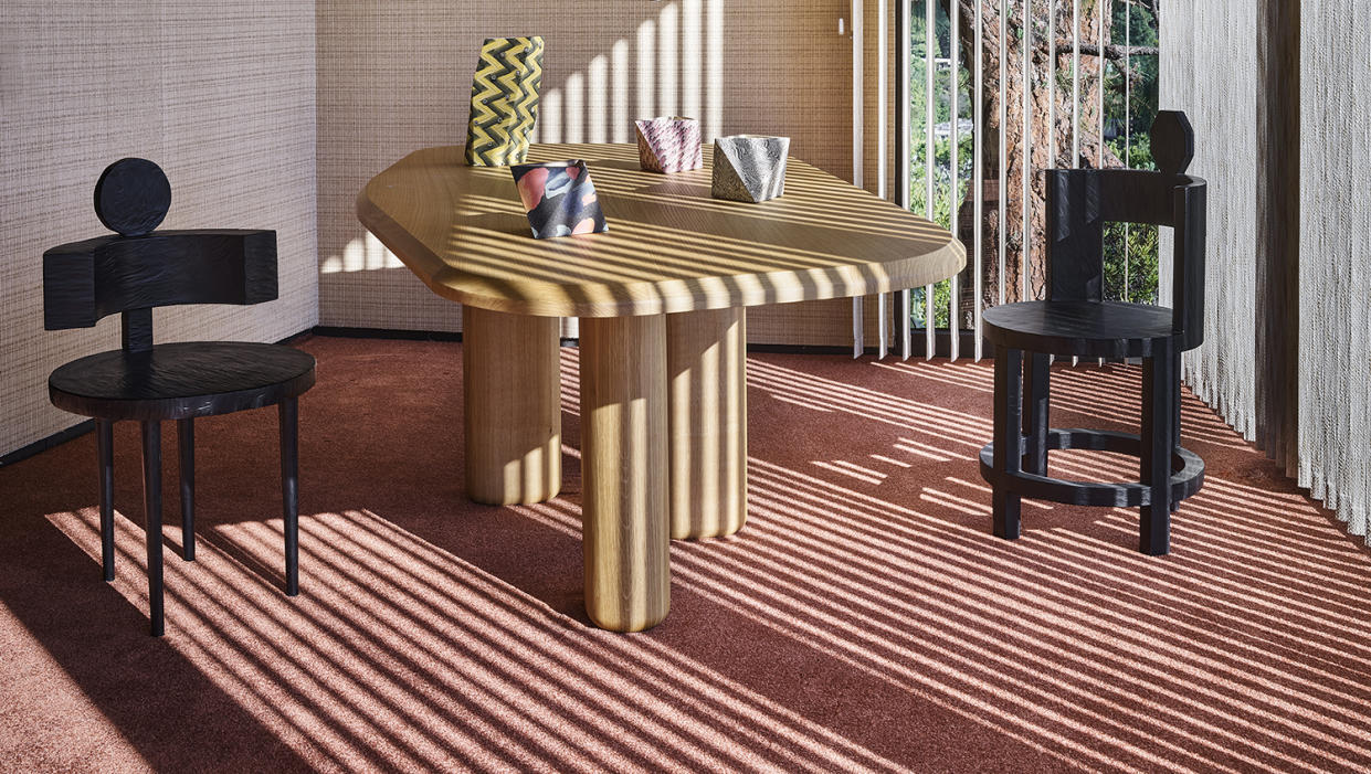
Rust-toned carpet colors are ideal for laid-back and tempting interiors like The Future Perfect’s former Los Angeles Gallery location. Not only does the copper hue complement the furniture and artwork, but it also reflects the natural light to create a candle-like glow across the room.
“This house was our third house in LA, designed in the 1970s by Raul Gaduno and it was a total deviation from our other locations, past and present…Honoring the period and aesthetic of the house was incredibly important to me, given all of the preexisting original details. My goal was for people who came to the house to question if the carpet wasn’t original,” says David Alhadeff, founder of The Future Perfect.
“I referenced a pretty wide palette from the ‘70s - avocado green, mustardy yellows, browns, and of course our final selection, maple. In the end, we selected maple because although some of the other colors worked really well in the space, like avocado green, the other colors felt ironic and we certainly didn’t want a periodic selection that poked fun at the architecture or period. Maple was a color that referenced the period, suited the house, looked original, and still felt relevant in a contemporary context,” David adds.
This beautiful project showcases the very best of wall-to-wall carpets by rewriting the 70’s wall-to-wall carpet story with a contemporary color palette that feels both authentic and current.
Buy into the look now

Coral rug
Size: 5'x7'
Price: $369

Antioch rug
Size: various
Price: from $85
