68 brilliant print adverts
While there might be a big focus on digital these days, the best print ads can still pack a real punch. Like digital ads, clever print ads have to compete for our limited attention and as we've seen in the best billboard advertising examples, it takes real creativity to truly turn heads.
But while the best print ads may be less hi-tech than newer advertising channels, like the best logos a little simple ingenuity can make them highly memorable. An arresting image and clever copy are usually the key, drawing us in long enough for us to process the message. Below, we've gathered a collection of some of the best print adverts from brands both big and small.
The best print ads we've seen
01. Pepsi trolls Coca-Cola
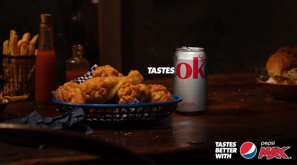
Pepsi and Coca-Cola have had a playful rivalry for some time now, but this creative ad is a prime example of effortlessly clever marketing. Known for its iconic "Tastes better" tagline, Pepsi switched the narrative for this Australian campaign, suggesting that in comparison, the rival brand is just "ok".
Pepsi's "Tastes ok" campaign lets Coca-Cola's design flaw do all the work, using the product's packaging to suggest its inferiority. It's a clever but risky strategy to base your marketing around your competitors, but when a genius marketing opportunity is hidden in plain sight, it's a golden opportunity to one-up the competition.
02. McDonald's brings new meaning to fast food
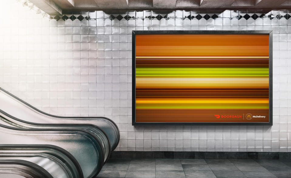
Famed for its iconic print ads, McDonald's is certainly a strong contender for the champion of advertising. This print ad features an array of the fast food chain's iconic burgers rendered at high speed, and despite the design being as simplistic as a set of horizontal lines, the products remain distinguishable. Designed by the creative agency No Fixed Address, this ingenious ad showcases the power of iconic imagery, offering a clever twist on familiar motifs.
03. Ikea accepts being second best
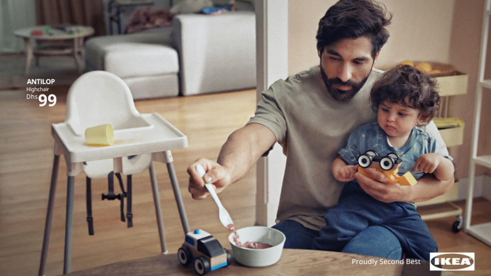
Spoiler alert: Ikea is going to crop up several times on this list of the best print adverts. This print campaign was one of its most recent, designed specifically for a store in the United Arab Emirates by DAVID Madrid and INGO Hamburg. It breaks one of the fundamental rules of advertising by recognising that its products are sometimes not the solution and actually get cast aside when children seek human contact.
04. The Land Rover passport ad
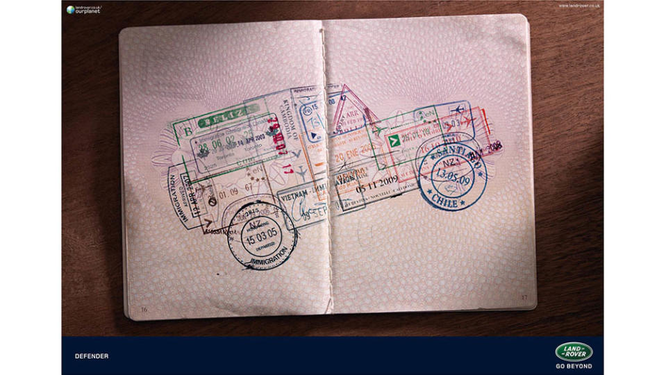
The best print ads often grab our attention by playing with our recognition of certain well-known products. That's best achieved through a simple, clear idea. This 2012 Land Rover print ad features two things we immediately recognise: a heavily stamped passport and the distinctive shape of a Land Rover. The ad was the work of RKCR/Y&R (now VMLY&R). The collage cleverly communicates the Land Rover's all-terrain characteristics, suggesting that it's ready for the challenge of any destination you might visit next. Now if only Land Rover's could fly.
05. Burger King's meaty trick
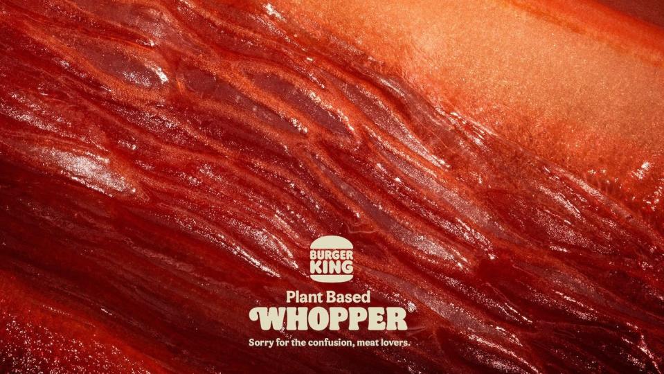
At first glance at Burger King's 2022 ad, you'd be forgiven for thinking you're staring at a macro close-up of some red meat. But no, those are peppers, beetroot and radicchio. This one is designed to make you double-take.
"Sorry for the confusion, meat lovers," reads the tagline – and indeed, you wouldn't know that's veg you're looking at. From the deep red colour to those thin fibres, the whole thing looks disconcertingly, well, meaty. This one was nominated for a CB at 10 Award as the best print ad of the decade.
06. Staedtler pencil buildings
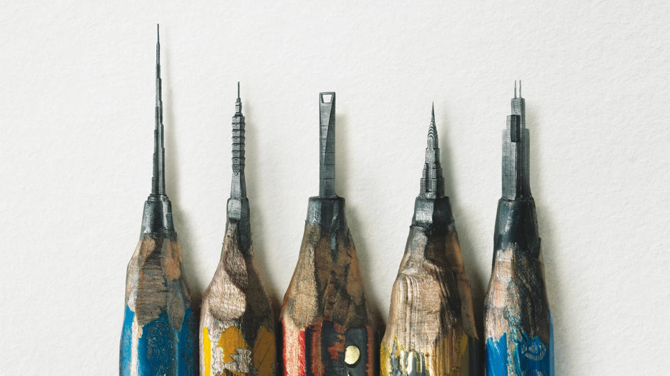
This campaign from a German pencil brand (by Leo Burnett Hong Kong) might just have left the sharpest impression yet. The poster for Staedtler pencils shows what looks, at first glance, like a bunch of bizarrely sharpened pencils. But look a little closer, and it becomes clear that you're looking at a series of impossibly intricate buildings carved into the lead. Find out more here.
07. The Kit-Kat lockdown ad
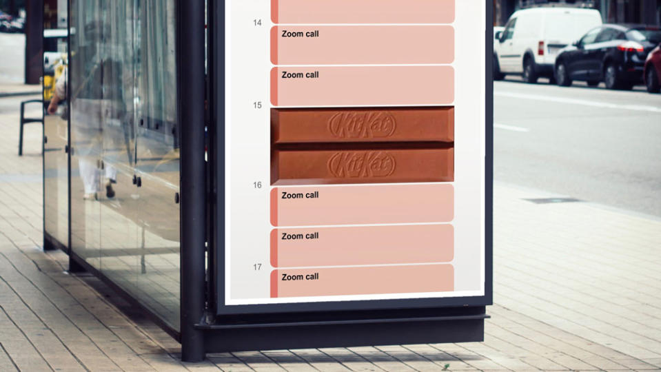
Every now and again a concept ad comes along that's so brilliantly done, it fools people into thinking it's an official design. Sam Hennig recently created this Kit-Kat ad, which plays on lockdown life so cleverly it's gained massive amounts of attention across the internet.
Made for the One Minute Briefs Twitter account, the advert shows a daily schedule, totally consumed by Zoom meetings, with a Kit-Kat duo blocking out two slots in the middle, at 3pm. It's simple, relevant and completely on-brand. In fact, it's so clever, many are praising Kit-Kat itself for the genius, before realising it actually has nothing to do with the brand, officially (though KitKat and Zoom have responded to it via Twitter). Read more about it here.
08. Norwegian Airlines
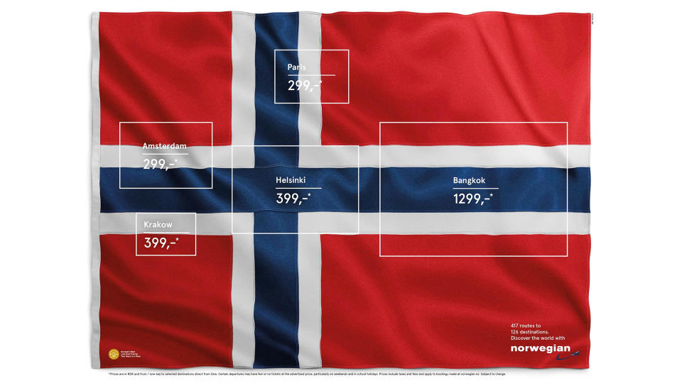
This ad resurfaced recently on the internet, with folk going wild for the genius concept, so we thought it worth including in this roundup. Originally created in 2015 by Stockholm-based agency M&C Saatchi, the ad, titled Flag of Flags, highlights five hidden flags inside Norway's (including France, the Netherlands and Finland). The destinations (and, of course, prices) are listed inside the rectangles in a pleasingly clean sans-serif typeface.
09. KFC (or is that Ikea?)

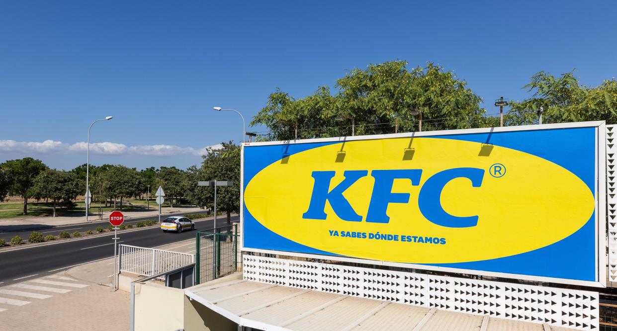
When KFC opened a new restaurant in an area of Majorca known locally as "where Ikea is"), the fast food chain decided to lean in to the association. Madrid agency PS21 mimicked Ikea's colour scheme and typography for the ad, leading to some good old brand banter between the unlikely rivals.
10. Sharper than you think
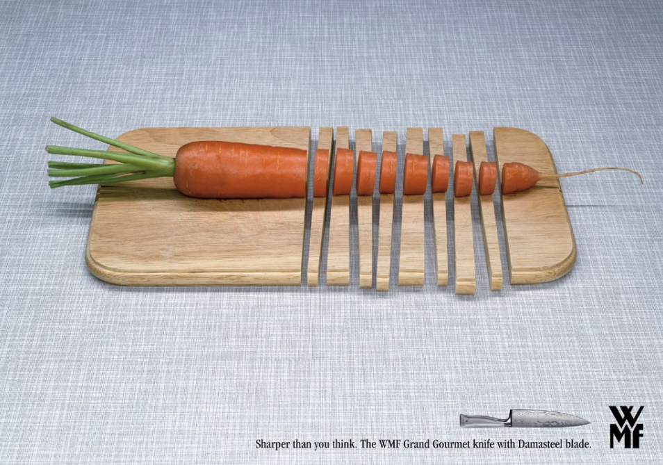
There's nothing worse than trying to cut, well, anything with a blunt knife. And so Hamburg-based design agency KNSK have nailed this print advert for the WMF Grand Gourmet knife. We're not sure why you'd ever need a knife that sharp, but this eye-catching ad leaves us in no doubt that this is one kitchen utensil you shouldn't mess about with.
11. Lime
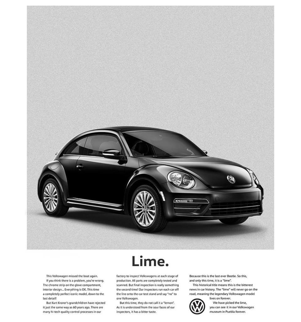
In 1960, VW sold its trustworthy design to the world by labelling a car a lemon, the word commonly used to describe production defects. It had a minor default, not noticeable to the eye but even so it was taken off the market.
Well, fast forward almost 60 years and a Beetle is, once more, taken off the market. This time it's not for any default but simply because tastes have changed. And so it is a 'lime', and worthy of our print adverts roundup.
12. Happy Diwali
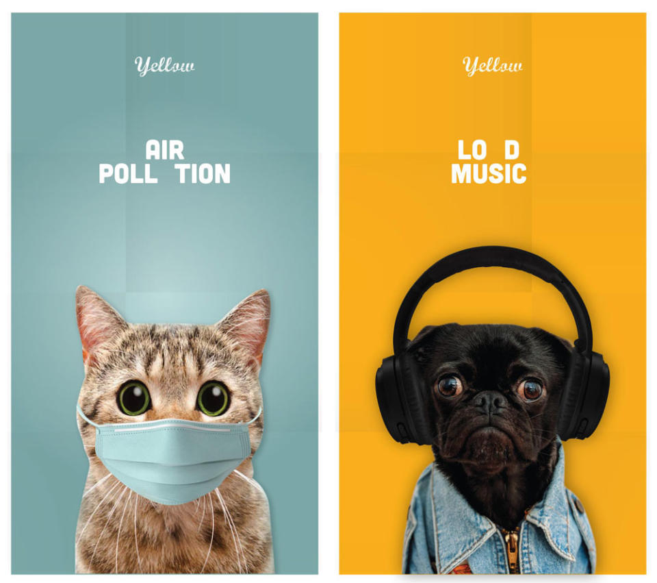
Ad agency Yellow uses a series of wide-eyed animals to highlight the very real problem animals face during Diwali celebrations. With super-bold imagery and bright colours, the campaign keeps the festival spirit. Juxtaposed against this, however, are the terrified eyes and shocking face masks of beloved pets and animals.
The images, strong enough to make this one of the best print adverts of all time, show how the animals could protect themselves against the different types of pollution were they able to, highlighting how it is down to the humans around them to protect them.
Or as the ad presents it: it's down to 'U': hence why the key letters are missing.
13. Children can be scary
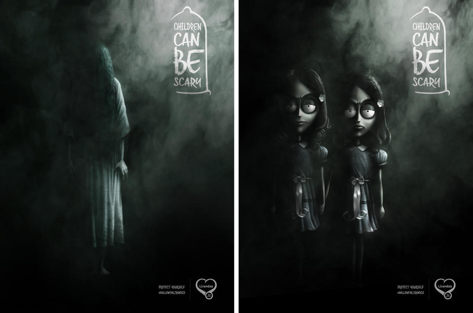
The importance of safe sex can be a tricky topic to address, but DDB Mozambique took a humorous route with this print ad for Lirandzo condoms. The designs feature famously terrifying youngsters from well-known horror stories, including the creepy twins from The Shining, and The Ring's goosebump-inducing Samara. Would you want one of these guys living in your house?
14. Ikea iDealisk
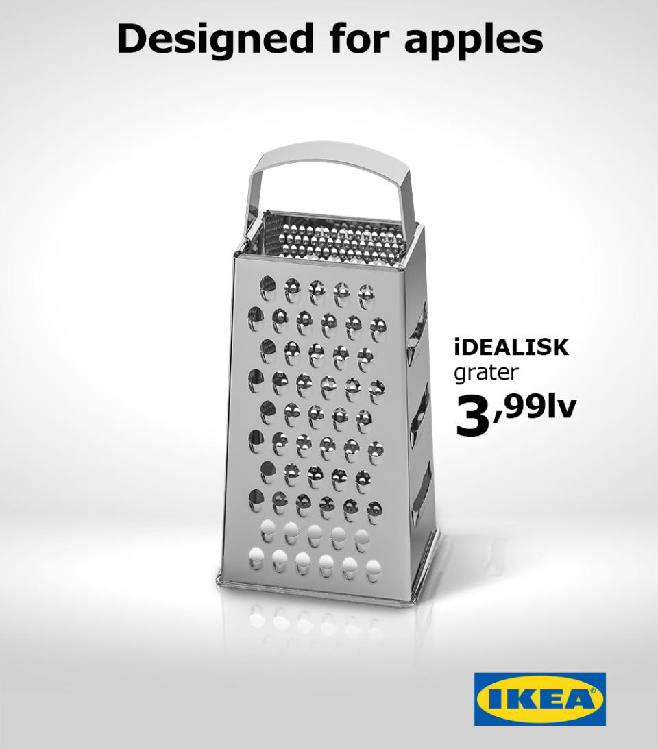
The previous model may have been likened to a trash can, but the when Apple unveiled its new Mac Pro in June 2019, the design drew unkind comparisons of its own: there was something decidedly cheese grater-ish about it. IKEA Bulgaria jumped into the discussion immediately, and within a few days it had released this killer ad. Created by advertising studio The Smarts, the design takes a bite out of Apple with its cheeky tagline and clever lower-case 'i' on the product name.
15. Hiper Centro Corona's optical illusion print advert
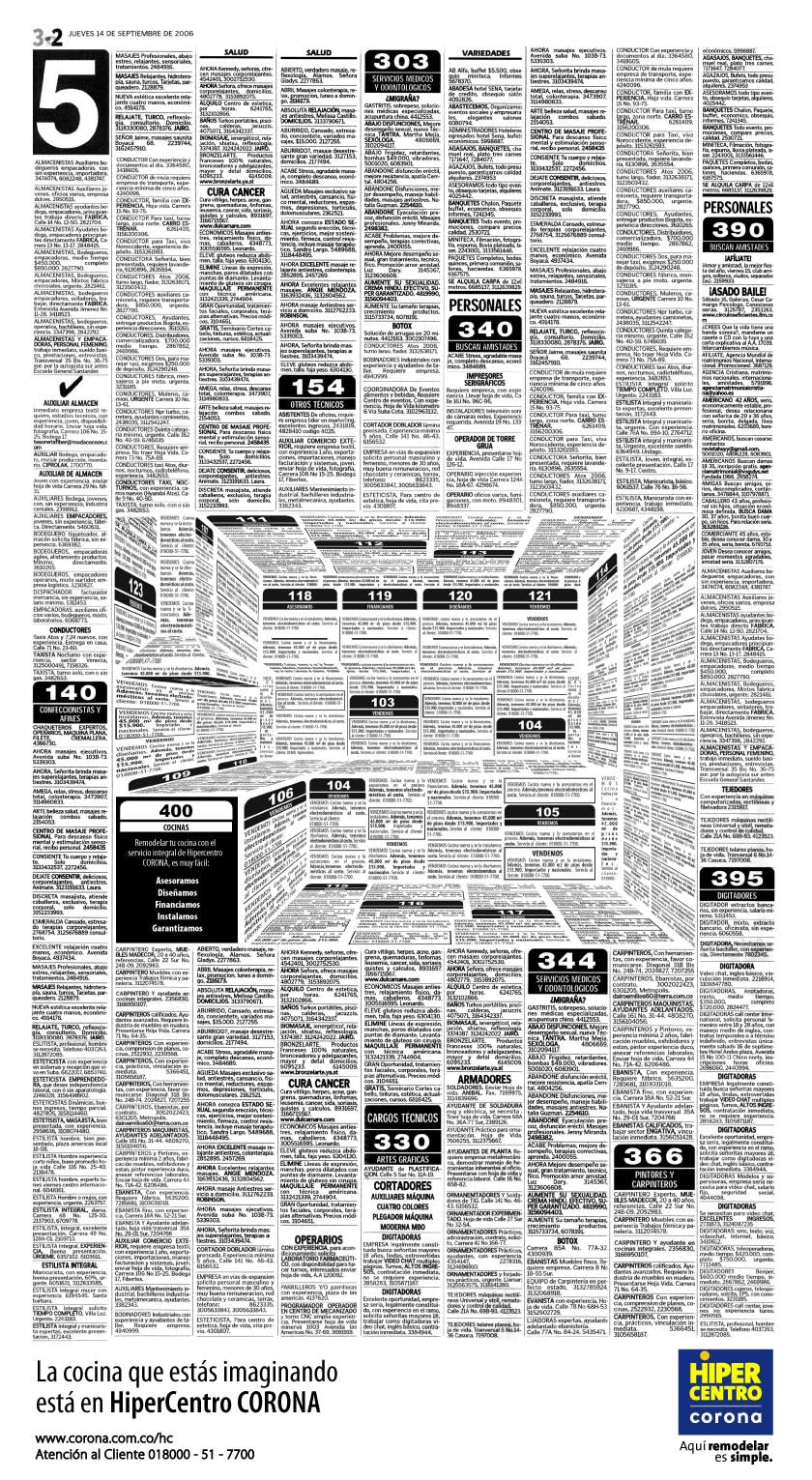
We love a good optical illusion here at Creative Bloq, and we've seen them come in all forms, from still images that appear to move to images that appear to change colour but don't. They're great for insights into how our brains work, but sometimes an optical illusion can make a great print ad too. The designer Felipe Salazar created this ad to advertise the kitchen offerings of Colombia's Hiper Centro Corona chain. At first glance it looks like a page of classified ads, but it's been designed in such a way as to form the shape of a kitchen, complete with extractor fan and kitchen tops.
16. Breakfast means breakfast
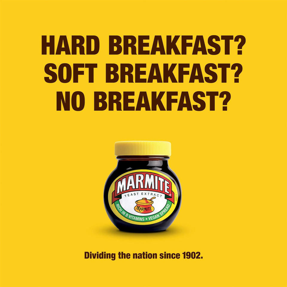
Popular yeasty spreadable, Marmite, has carved out an admirable little niche for itself as shorthand for anything that polarises opinion. And over the last couple of years there's been nothing quite so Marmitey in the UK as the result of a certain referendum, so this recent ad, created by Oliver's in-house team at Unilever, feels kind of inevitable. Well played, Marmite. Too soon, but well played.
17. Copywriter needed
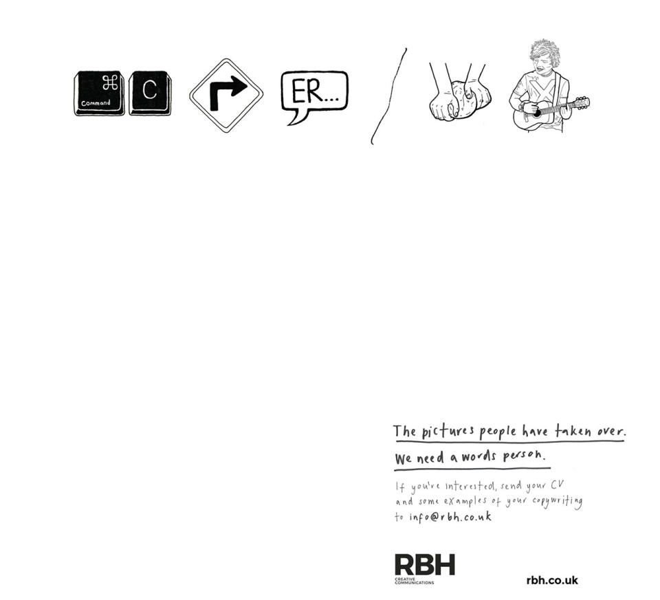
There's nothing particularly new about using pictograms to spell out a message in an advert, but we love the twist behind this one. It's a recruitment ad for a copywriter put out by RBH, and the illustrated pictograms spell out 'Copywriter needed', with the ad going on to state that, 'The pictures people have taken over. We need a words person.'
18. You eat what they eat
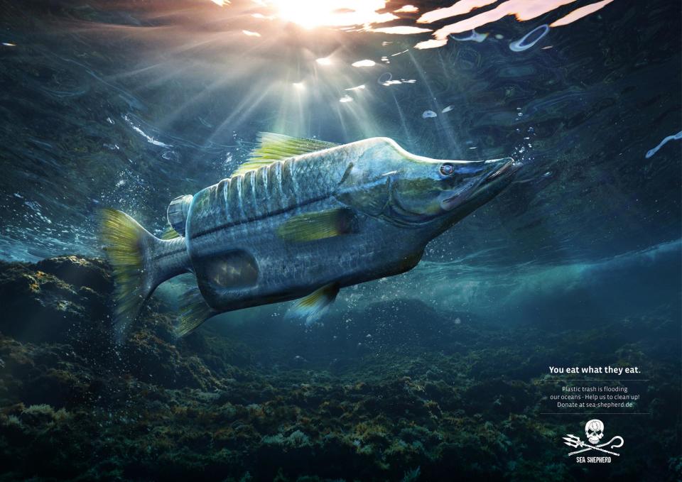
The amount of plastic being dumped in the ocean is so far beyond what we can comprehend that it doesn't bear thinking about. But that doesn't mean we shouldn't, as the team at German advertising company Ogilvy highlight with this campaign for Sea Shepherd Conservation Society (SSCS), an international non-profit, marine wildlife conservation organisation. The print ad campaign depicts a number of different fish, misshapen by various plastic objects, with the tagline 'You eat what they eat'. The ad goes on to encourage viewers to help clean up our oceans by donating to Sea Shepherd.
19. Open all night
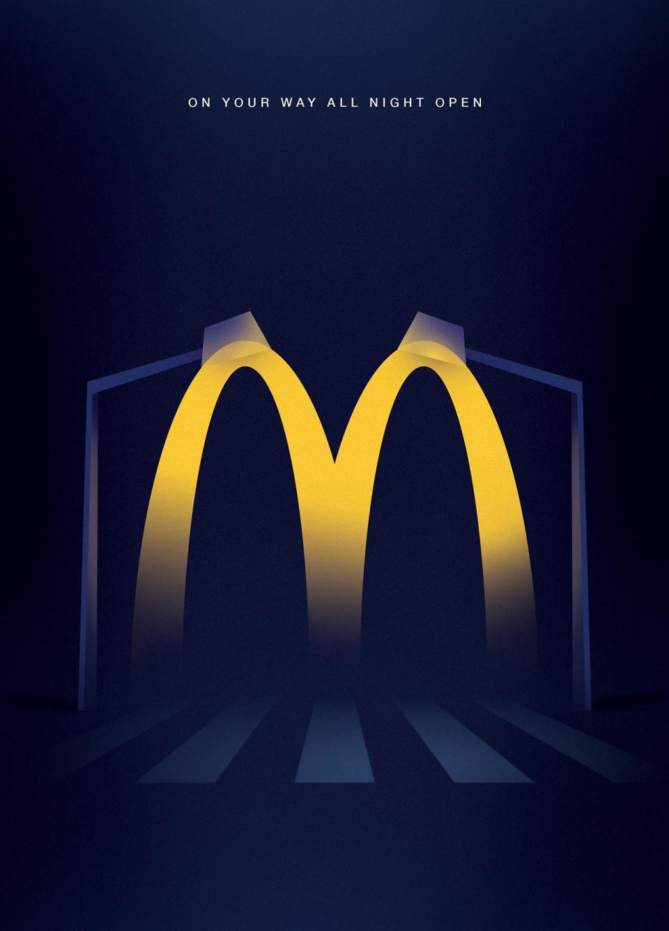
Another great offering from McDonald's, this time from the team at Leo Burnett, who followed the modern and minimal aesthetics of McDonald's communication with this striking visual. In a clever use of illustration, the iconic 'M' becomes lights in the night, sending viewers the message that no matter what time they want to visit, even in the middle of the night, McDonald's is open for business.
20. Where there is one, there are more
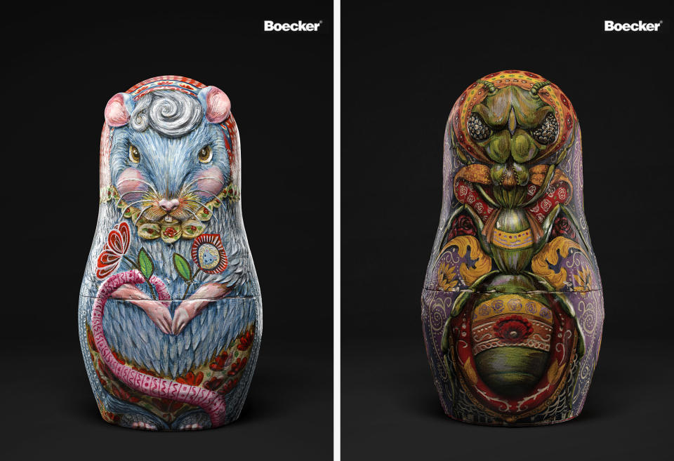
Boeker Public Health is a major pest management and food safety company based in the Middle East. JWT Dubai created these beautiful-but-gross print ads based on the idea that when it comes to pests, if there’s one, there will be more. The agency focused on replicated an authentic Russian Matryoshka doll aesthetic, first painting each design onto a wooden surface, then mapping these designs onto a 3D rendering of a doll. The project picked up multiple awards.
21. Piknic électronik
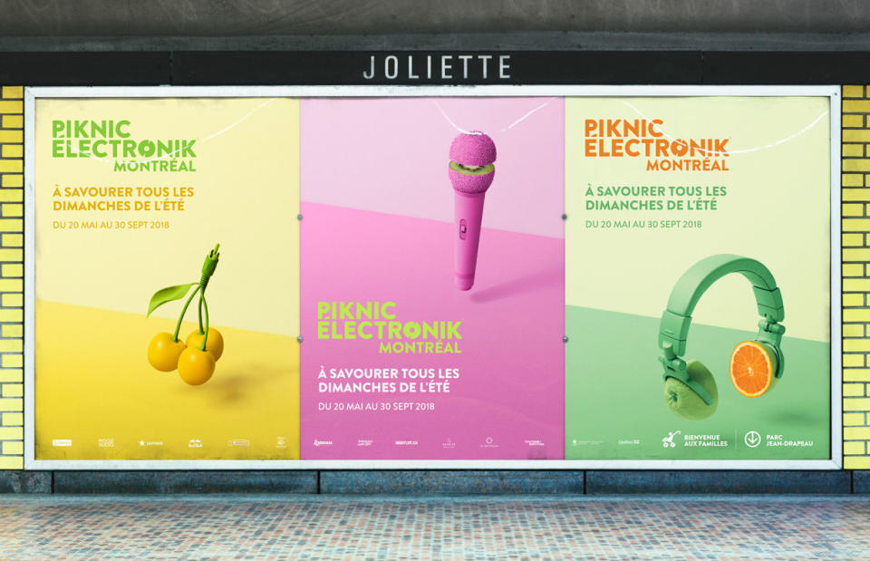
This long-running print ad campaign can be found on the streets and subway stations of Montreal, promoting an all-day electronic music festival that is held every Sunday in a park throughout the summer. The adverts feature bright, poppy photography combining fruits with musical equipment; a simple concept that effectively captures the idea of ‘fresh sounds’. Ethos, the studio behind the campaign, created the images by photographing real objects that had been hand-painted in different colours.
22. A Better Job is Waiting
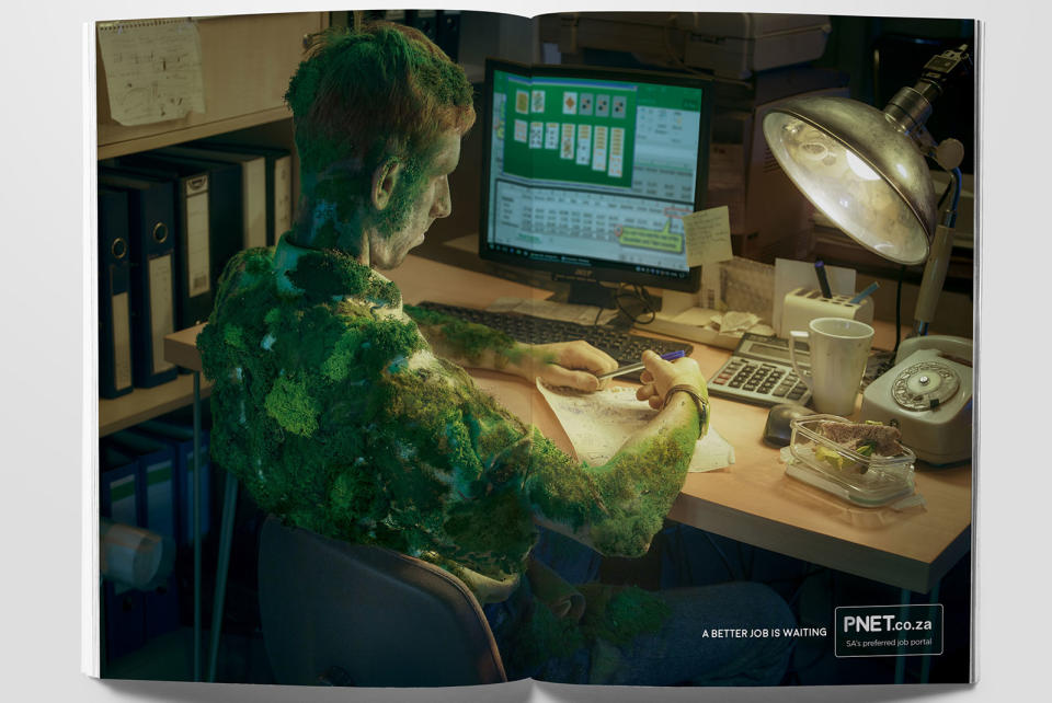
Created by Joe Public United, this print campaign for a job portal aims to motivate people to stop slogging it out in a job they don’t like. Deftly retouched photos show bored workers at their desks, sat still for so long mould has started to grow on their bodies, or spiders have set up their webs on them.
23. Lickin' chicken
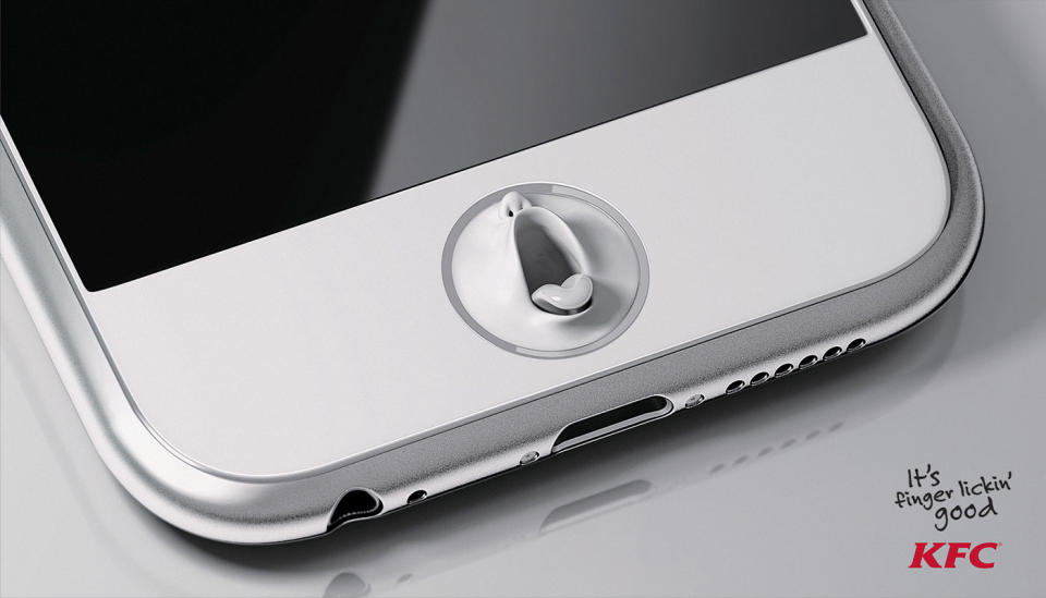
If there's one thing we all know about KFC, it's that it's finger-lickin' good, and it's this irrefutable fact that's inspired this series of frankly unsettling print ads. In them, everyday objects suddenly sprout mouths wherever your fingers might touch them, in the hope of licking off a little of the Colonel's chickeny goodness. It's the work of Zane Zhou, along with LamanoStudio in Chile. Thanks for tonight's nightmares, guys.
24. Kiss with Pride
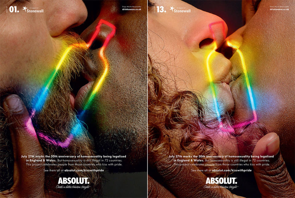
It's been over 50 years since homosexuality was decriminalised in England and Wales, but today it's still illegal in 72 countries around the world – and punishable by death in eight. To highlight this, Absolut, in collaboration with LGBTQ charity Stonewall and BBH London, created this series featuring close-up shots of same-sex kisses, with many of the subjects coming from the countries where these kisses could land them in prison, or worse.
25. Pass the Heinz
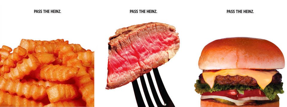
If these clever adverts for Heinz look kind of familiar, it's with good reason. They originally featured in an episode of Mad Men where Don Draper tried to pitch a series of ads showing food that goes great with ketchup, but without the ketchup itself visible. Draper argued that people would fill in the gaps for themselves and create a stronger association in their mind, but Heinz wasn't going for it. In real life, however, the company's on board with the idea, with DAVID Miami, rolling out these near-exact reproductions of Draper's pitch.
26. Flame grilled
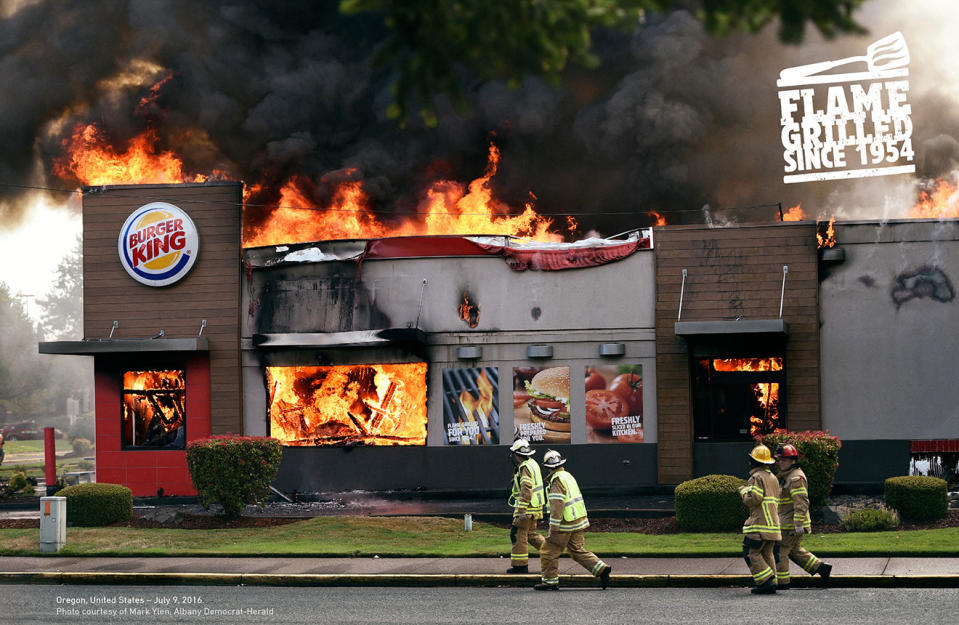
Burger King prides itself on flame-grilling its burgers rather than frying them, but we all know how fire can misbehave if you don't keep a close eye on it, right? Burger King holds the record for the most restaurants that have burned down since 1954, and that's the brilliant angle seized by DAVID Miami in one of its many innovative campaigns for the company, using genuine photos of blazing BKs to emphasise how it cooks its burgers.
27. FCK
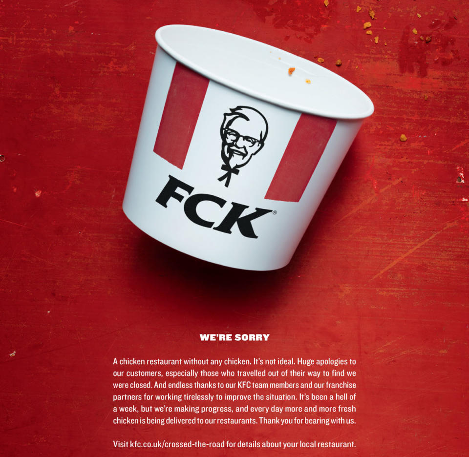
In spring 2018, the unthinkable happened. KFC ran out of chicken. Thanks to problems with a new distributors, the Colonel ended up temporarily closing most of its 900 UK restaurants. KFC handled it like a true pro, putting its hands up and accepting responsibility, and bringing in Mother London to create a print ad apology that instantly went viral. It even picked up a Wood D&AD Pencil in writing for advertising. Check out more companies that have mastered the art of saying sorry (or not) in our roundup of the good, the bad, and the WTF of brand apologies.
28. Pee on this ad
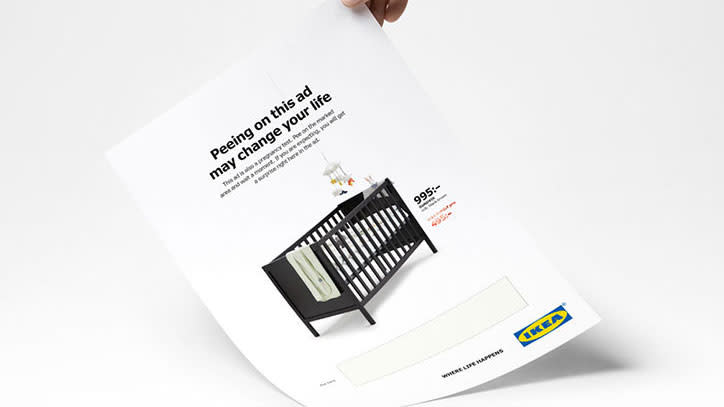
Usually, if someone wants to wee on your advert, it's not a good sign. However, Ikea actively encouraged it in this crib advert, which doubles up as a pregnancy test. If the result was positive, the retailer would offer the mum-to-be a half-price crib, shaving pounds off the several thousand they'll be shelling out for their upcoming bundle of joy. To create this ad, agency ?kestam Holst worked in partnership with material technology company Mercene Labs.
29. Delta Dating Wall
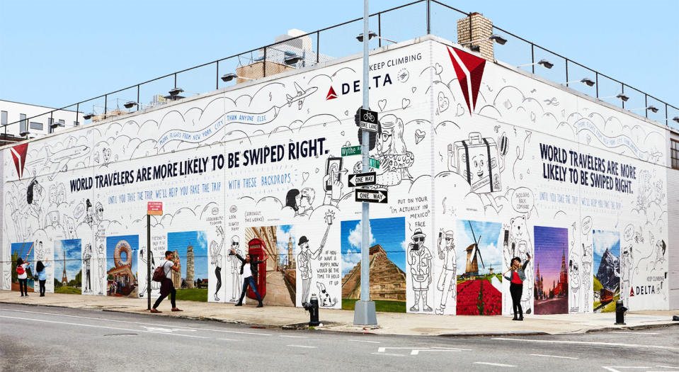
According to Delta, world travellers are more likely to attract right swipes on Tinder, but what if you can't afford to go away to snap that perfect profile pic? That's what Delta – along with Wieden+Kennedy New York and Colossal Media – addresses with the Delta Dating Wall, an epic print advert in Williamsburg, Brooklyn, featuring exotic backdrops that you can stand against for a selfie, instantly making you a lot more windswept and interesting.
30. Random cabbage
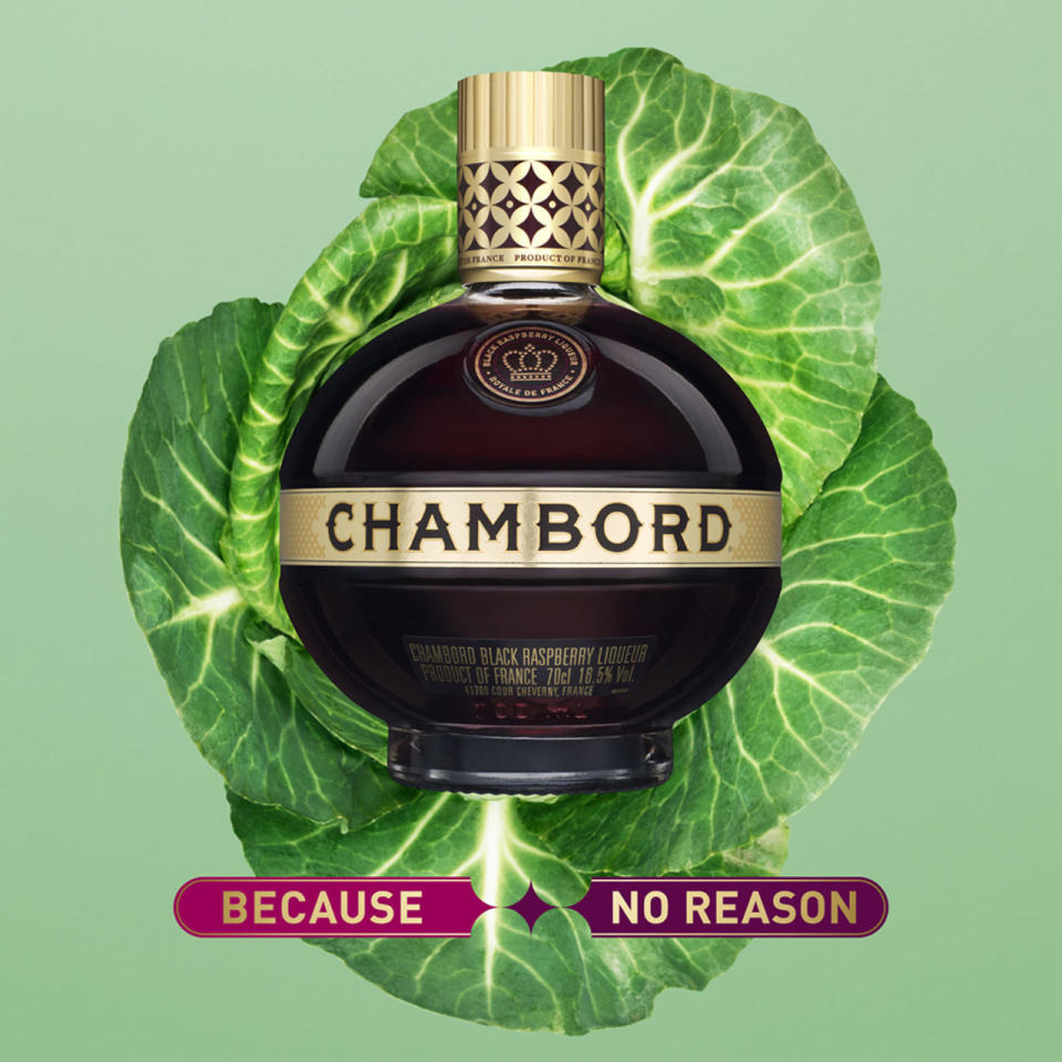
Wieden+Kennedy London was tasked with raising the profile of Chambord among a target audience of women aged 24-35. It used the campaign to push back against the pressure on women to conform to certain rules with its 'Because No Reason' tagline that encourages people to do what they like, just because they like it. Chambord with cabbage? Why not?
31. Ridiculous possibilities
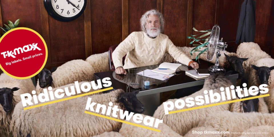
You never know what you'll find when you go shopping in TK Maxx, and the spontaneous, surprising nature of the shopping experience in this designer discount shop is brought to the fore by this campaign emphasising the 'ridiculous possibilities' that lie inside. It's the work of Wieden+Kennedy, with other examples highlighted including smartly dressed women scaling the side of a building on a rope made of silk scarves, and a biker doing ballet.
32. See what you want to see
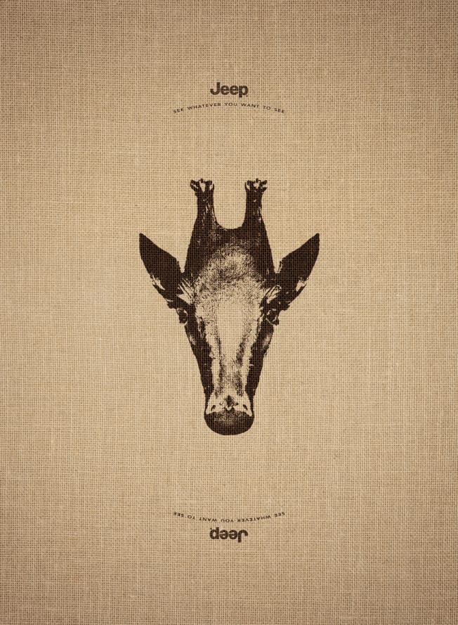
This print ad campaign was created by Leo Burnett France, and plays on the idea that with Jeep, you can go wherever you like and 'see what you want to see'. Each ad features an image of an animal, which, when turned upside down, turns into another creature from the other side of the world: the giraffe becomes a penguin, the elephant a swan and the doe a sea-lion.
33. Save paper
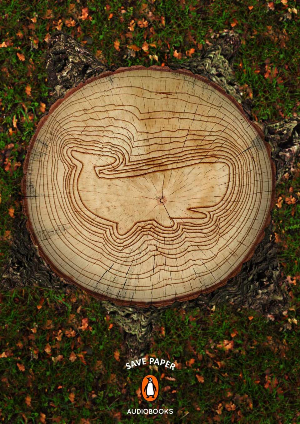
It's a bold move for a company that has built itself on selling paper books. When Penguin needed to push its audiobook offering, Miami Ad School decided to tackle the eco issues of paper production head-on. The intricate illustration in the bark is a lovely touch.
34. Take a breath
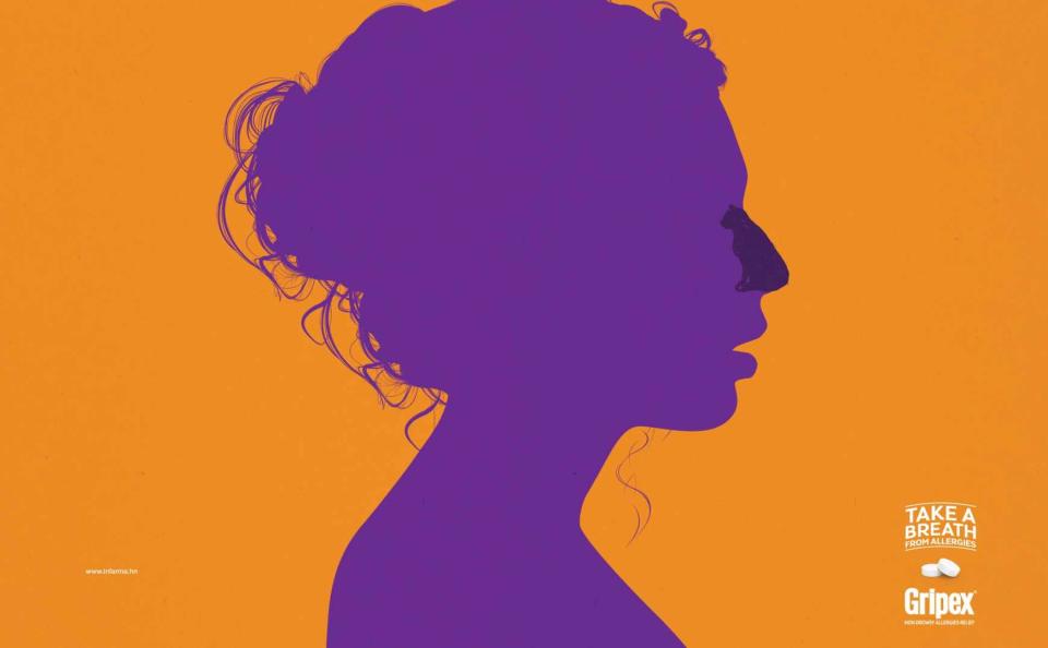
Ogilvy once again proves itself as a print advertisement master, this time in a campaign for allergy medicine. Simple yet effective colours and a smart illustration trick – using the silhouette of common allergens to 'block' the figure's nose – make this an ad that pops from the page.
35. Sticky ad
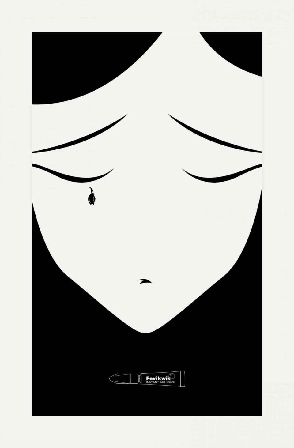
Ogilvy is known for creating some of the best print advertisements around the world. This is just another example of its brilliant work. Created for Fevikwik Instant Adhesive, it's one of a three-part print advertisement series that uses clever illustration and a monochrome colour scheme to its fullest potential.
36. We are made of rock
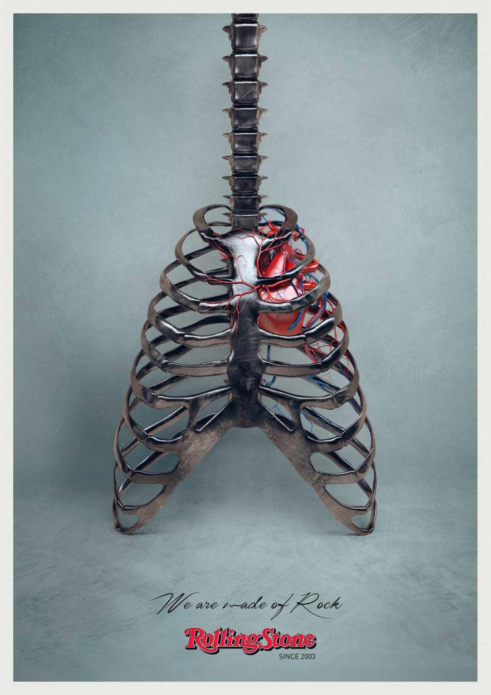
Created by DLV BBDO in Milan, Italy, the simple execution of this print advertisement works wonders for music magazine Rolling Stone. A cool image paired with a brilliant tag line ('We are made of rock') capture the brand's attitudes, product and ethos effortlessly. Using a signature-like handwriting font also ties in with the rock star aesthetic.
37. Yoga for your back
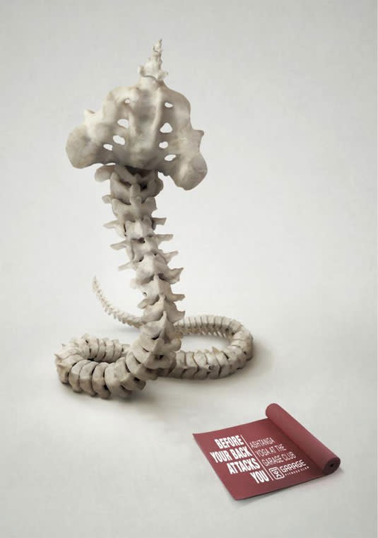
Created by Israel-based advertising agency McCann, this print ad for Ashtanga Yoga homes is on the benefits of yoga. In it, the bones of the spine are transformed into a snake; a concept that also deftly captures the idea that yoga will bring you a super-flexible back. The tagline 'Before your back attacks you, Ashtanga Yoga at the Garage fitness club', drives the point home.
38. Penguin Books
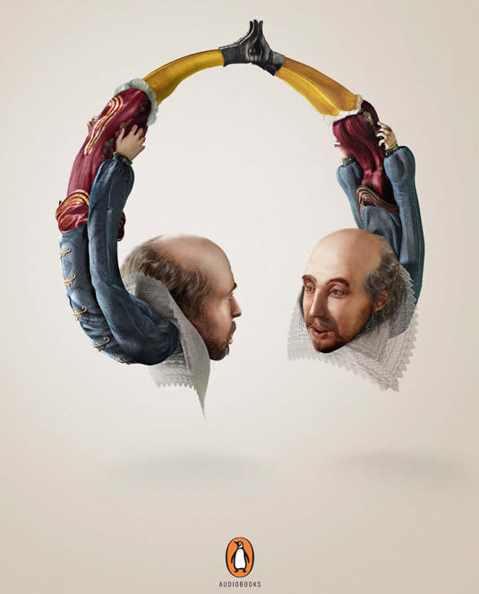
Penguin Books used another brilliant print ad to promote its audiobooks. The campaign features illustrations of three famous authors – William Shakespeare, Mark Twain and Oscar Wilde – shaped into headphones so they could whisper directly into the ears of their listeners. Developed by team at McCann India, the campaign won a Gold Press Lion at Cannes International Festival of Creativity.
39. Choose One
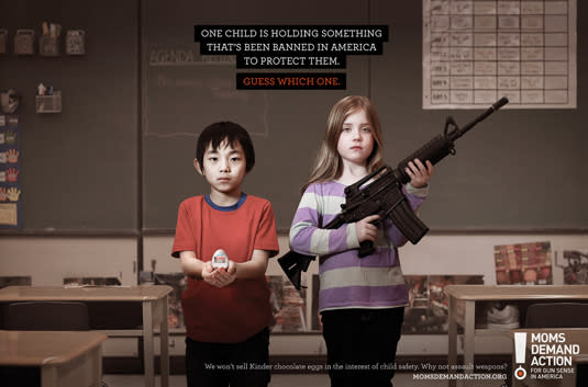
Grey Canada created this print ad campaign for Moms Demand Action, a collective of mothers calling for gun law reform. While the conversation has moved on somewhat since these print adverts were released in 2013, the campaign still hits hard.
Focusing on gun violence in schools, the Choose One concept features a child carrying a weapon, alongside a classmates holding either a Kinder Surprise egg, the book Little Red Riding Hood or a ball from the schoolyard game Dodgeball. One child is holding something that's been banned in America to protect them, with the audience asked to guess which one.
40. Expedia
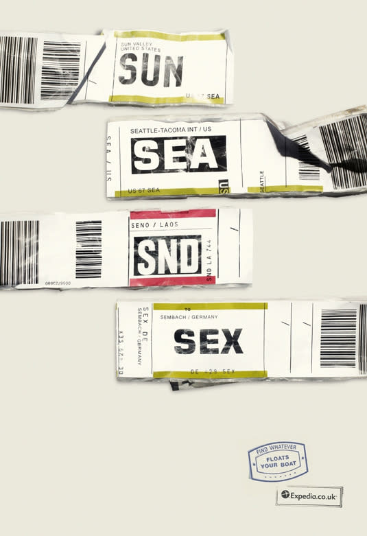
This ingenious advertising campaign by Ogilvy for travel brand Expedia uses airport IATA codes to great effect. The idea came about after the team noticed a woman walking through Heathrow with the word FUK hanging off her suitcase.
With over 9,000 airports around the world, each with its own three-letter code to choose from, the team created a series of prints. The tagline appears in the form of passport-style stamp: 'Find whatever floats your boat'.
41. Whiskas
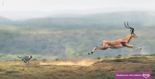
Abbott Mead Vickers BBDO's Whiskas campaign features a household cat in various scenarios in the wild planes of Africa. The clever 'Big Cat, Small Cat' campaign was shot by photographer George Logan, and highlights a cat's basic instincts. The series of print ads include dear Mittens hunting down gazelles, elephants and zebras in the wild. And we're particularly fond of the ad that shows a fully grown male lion bonding with the same cat as if they were family.
42. Alzas Bajas magazine
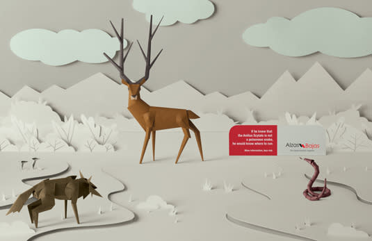
This beautiful print ad was developed by JWT, Buenos Aires for Argentinian magazine Alzas Bajas. The team created four paper art images, including this gorgeous wildlife scene. Each are accompanied a small amount of explanatory text followed by the tagline 'more information, less risk'.
43. Duracell
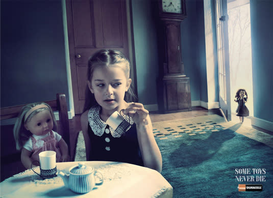
Terrifying but brilliant, this is one of those print ads that shouldn't work but somehow does. The advertisement for Duracell features a sinister-looking doll in the doorway of a little girl's playroom, accompanied by the tagline 'Some toys never die'. Developed by advertising agency Grey in Singapore, this is certainly a unique way to promote longer-lasting batteries.
44. Dog Chow
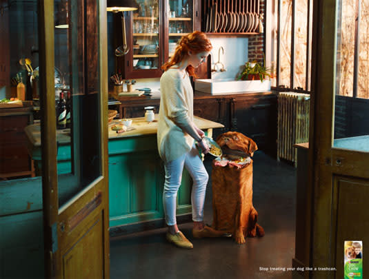
The best print ads combine brilliant art direction whilst still maintaining the brand's image and ethos. And here's a great example that instantly put a smile on our faces. Dog Chow is a dog food from Purina, and Publicis was tasked with creating a series of ads to promote it. Entitled 'Stop treating your dog like a trashcan', the series taps into pet owner guilt and encourages them to shell out for some top-quality dog food.
45. SANCCOB
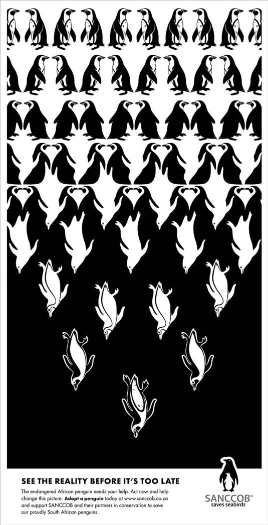
Ad agency McMillan encouraged animation lovers to rediscover the child inside with this print ad campaign promoting the Ottawa International Animation Festival (OIAF). Each of the five print ads features a gorgeous illustration and the tagline 'Get in touch with your inner child'. Some of the drawings contain mature content (see the full set here) but the cartoon-style characters and graphics maintain a fun, tongue-in-cheek vibe.
46. Wacom Bamboo
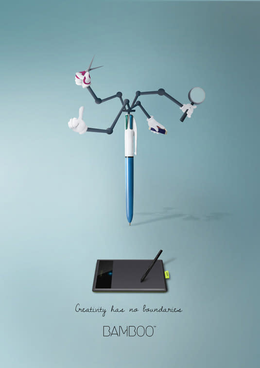
To promote design tablet king Wacom's Bamboo series, art director and illustrator Maria Molina developed this set of prints under the tagline 'Creativity has no boundaries'. The campaign includes three illustrations, each featuring various design tools with a twist that adds extra Inspector Gadget-style functionality. Bright colours, minimal text and simple graphics work perfectly together in this campaign.
47. Holes
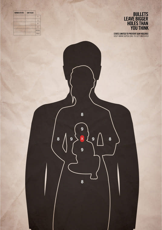
This hard-hitting print ad campaigning against gun violence comes from advertising and marketing agency Grey New York. The ads feature a single bullet target affecting three humans (including a small baby), and call for an update to the USA's antiquated gun laws. The ad, commissioned by non-profit organisation States United to Prevent Gun Violence, features the tagline 'Bullets leave bigger holes than you think'.
48. SMS mistype
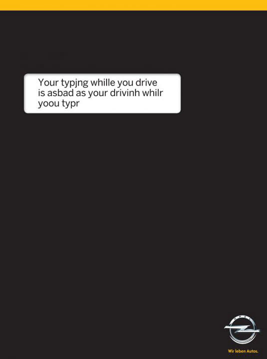
We all know the dangers of using a mobile phone while driving. But we really like the simple but clever way ad agency Gitam BBDO points out the facts in this road safety message from car manufacturer Opel. The cool print has a black background, replicating a phone while at the same time making the white box of text all the more prominent. It's a simple but really effective concept.
49. diaTribe
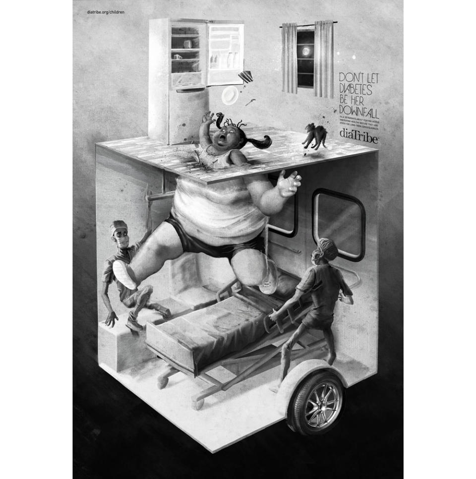
Healthcare agency Area 23 doesn't pull any punches in this campaign for diaTribe Foundation. The series, with the tagline 'Don't let diabetes be his/her downfall', aims to raise awareness about how childhood habits can lead to diabetes later in life. Two not-so-subtle illustrations capture a young boy falling directly from his fast food lunch into a hospital chair, and a little girl late night fridge raid landing her in a waiting hospital bed.
50. Who will inherit your greatest wealth?
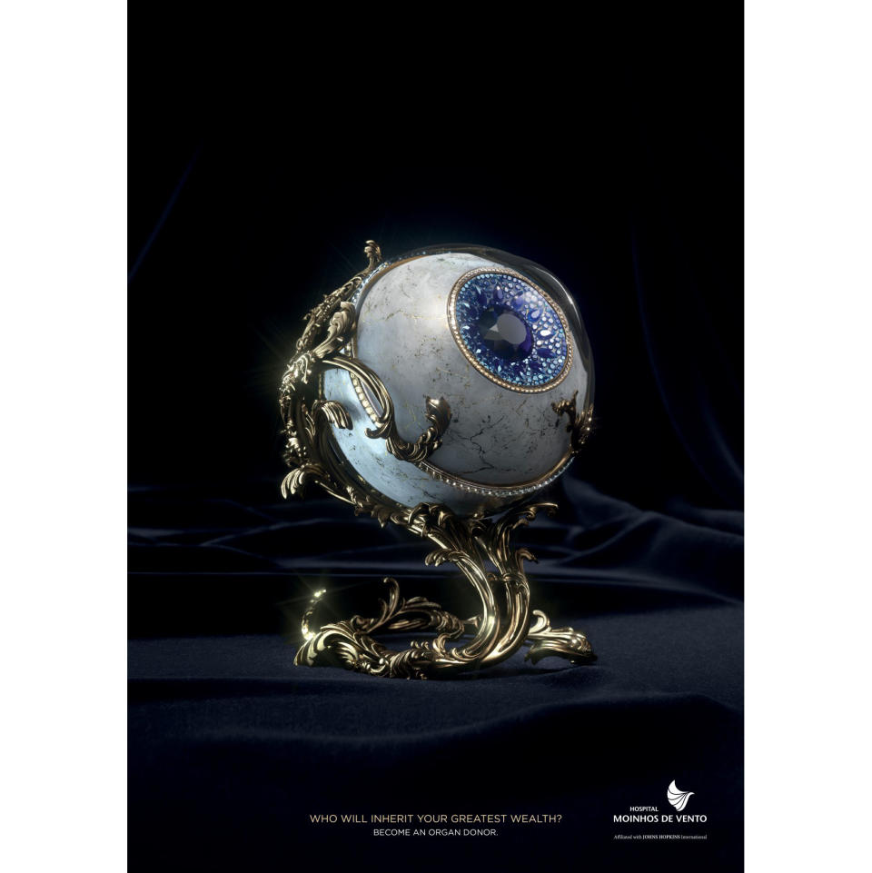
How do you impress on the general public the value of organ donation? McCann Health skipped over any emotional angles and appealed to the general public's materialistic side in this series of print adverts for a Brazilian hospital. The images show different organs reimagined as precious objects, and ask the question: Who will inherit your greatest wealth?
51. Schusev State Museum of Architecture
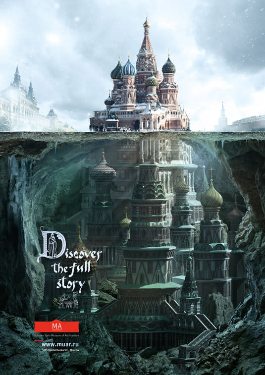
This beautiful illustration of St Basil's church in Moscow was created by ad agency Saatchi & Saatchi to promote the information available at the Schusev State Museum of Architecture. The campaign features a series of photographs of famous Russian landmarks, all of which are continued beneath ground (or water) level, and feature the tagline 'Discover the full story'. The stunning imagery is the thing that really sells this campaign.
52. One Accident is Enough
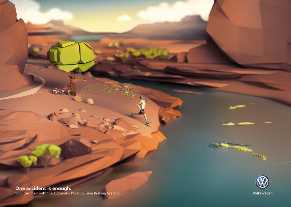
When DDB was tasked with promoting Volkswagen's Automatic Post-Collision Braking System, it responded by seeing the humour in the situation. This series of print ads each captures a series of accidents and asks readers to 'stop the chain'. Who doesn't enjoy seeing a man crashing his bike into a tree, upsetting a bees' nest in its branches, and being chased by those bees into a crocodile-infested river? Subtle details in these ads encourage viewers to stop and engage with the images for longer than they might usually.
53. Flipped
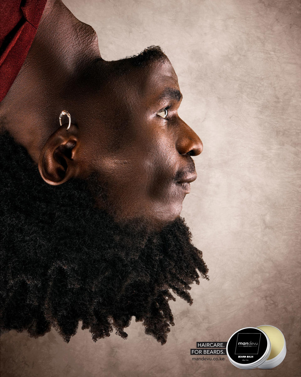
Beard hair just doesn't get the same kind of attention as head hair. Mandevu aims to change all that with its range of 'haircare for beards'. Ad agency Creative Y&R put together a series of adverts that flip the model's facial features, putting his beard on his head while his head hair becomes his beard. The unusualness of the image instantly captures the viewer's attention.
54. The Don't Drive Sleepy ad
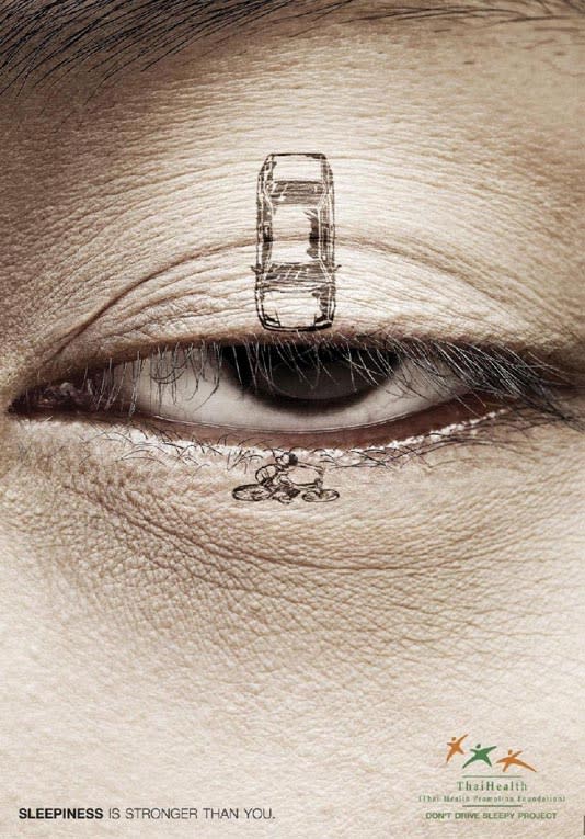
BBDO Bangkok steered clear of overly graphic imagery in this ThaiHealth advert warning of the risks of driving while you're sleepy. A car illustration appears on one side of a closing eyelid, and a bike or pedestrian on the other, making it very clear what could happen if your eye closes for even a second whilst driving. The tagline 'sleepiness is stronger than you' helps emphasise the danger.
55. Hubba Bubba print ad
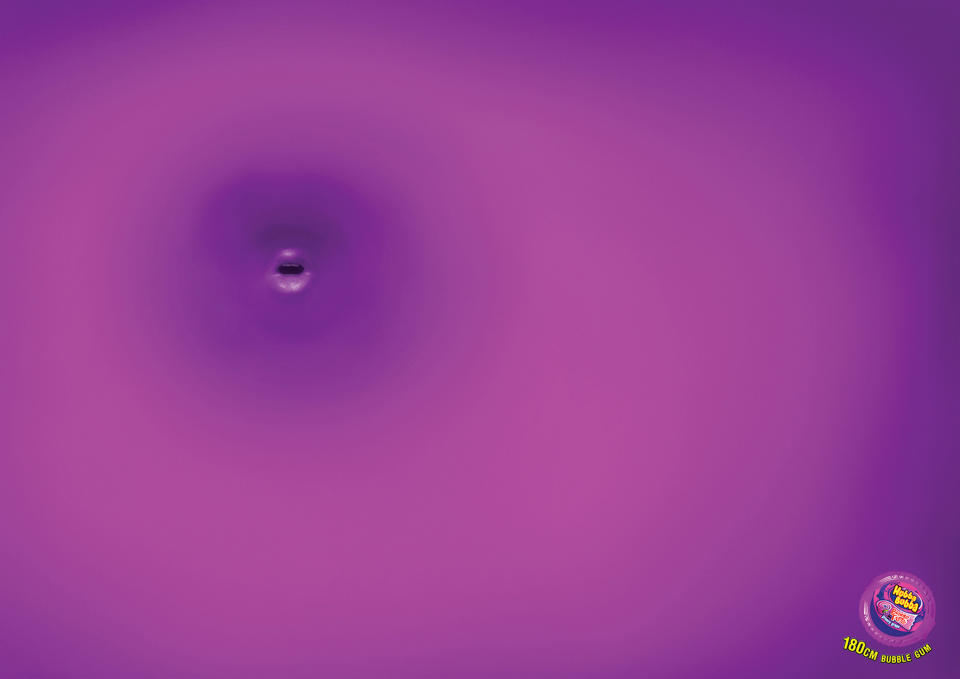
Here's another great example of print advertising from the folks over at DDB, this time for bubblegum brand Hubba Bubba. It's not immediately obvious what's going on in this one, so the designer has relied on the use of bold colours to catch viewers' eyes and encourage them to engage with the advert long enough to figure it out. This clever print ad focuses on a longer length of the bubblegum, which means bigger bubbles (presumably). DDB puts the onlooker right in the middle of one.
56. Utopolis cinemas
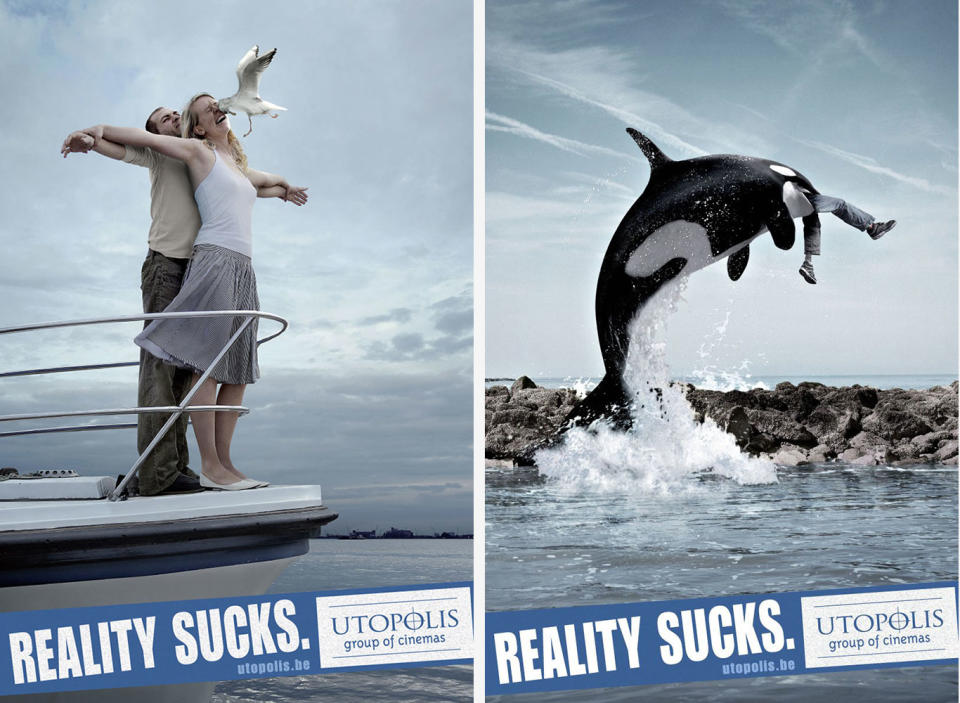
Print best ads don't always need intricate illustrations or photorealistic 3D renderings to make an impact. This one, created by Belgian advertising agency Duval Guillaume for a cinema group, plays the humour card and does it well. The ads capture classic movie scenes with an unwelcome twist of realism. Subtly grim details, such as the cloudy weather and less-than-spectacular boat in the Titanic recreation, really amp up the comedy in this series.
57. Sanzer Hand Gel advert
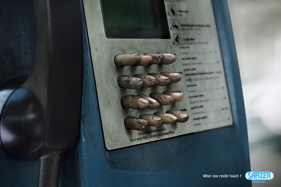
Chances are, when you first looked at this print advert, it made your stomach churn a bit. When Thai ad agency Chuo Senko was asked to create a promotion for Sanzer anti-bacterial hand-gel, it really went for the repulsive route. This series of print ads take the invisible grime and germs that cover public objects and makes them oh-so-visible. Are you looking at your keyboard and wondering what horrors really lurk there? Perhaps you should go and wash your hands, just in case.
58. Good Night
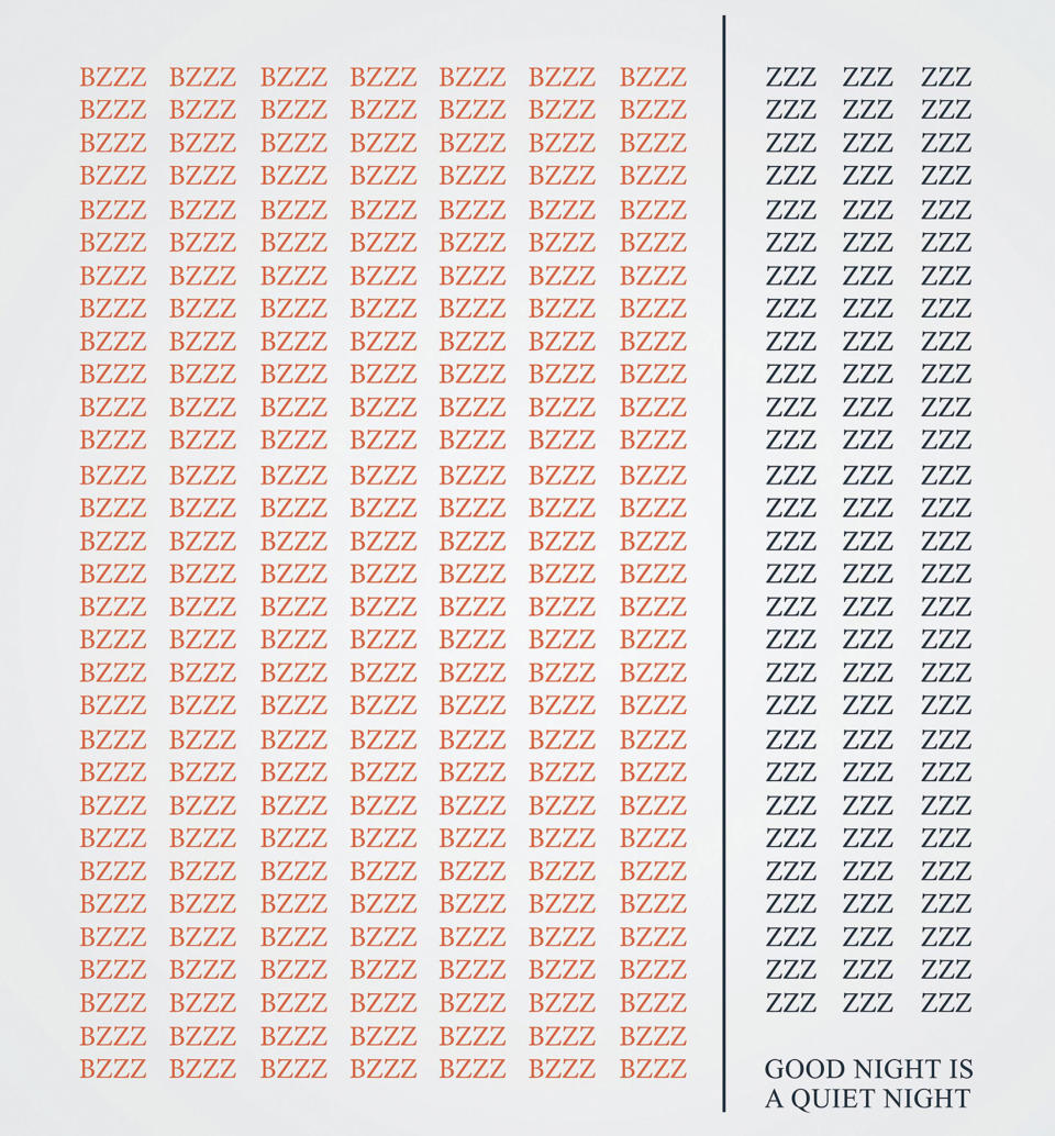
Kazakhstan-based advertising agency Veent created this clever print advert for window brand Ekopen. The campaign promotes the brand's range of mosquito nets, deftly capturing the idea that buzzing insects will hinder a good night's sleep, using only typography. A single dividing line provides a clear representation of the net barrier itself, while remaining in-keeping with the typographic style of the advert.
59. Nilkamal plastic chairs
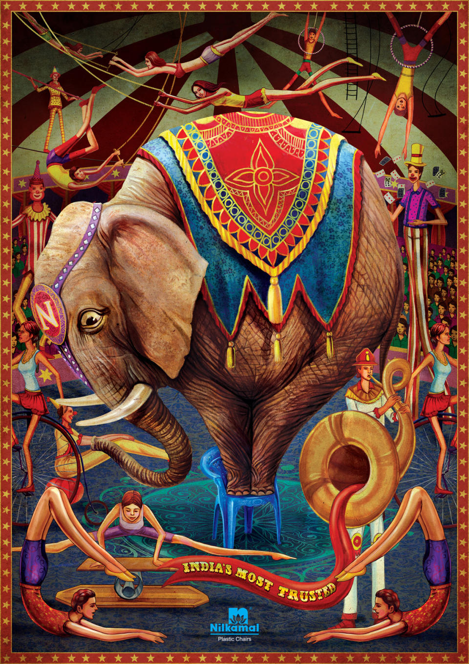
Illustration can be used to great effect in print advertising campaigns, including this gem from Nilkamal plastic chairs. The elephant standing on one of the products clearly shows off the strength and stability of the product, while the intricate illustration style and beautiful colours elevate the concept further. This ad was created by brand communications agency Makani. A nice touch is the fear in the elephant's eye as it teeters on its too-small chair.
60. True Colours
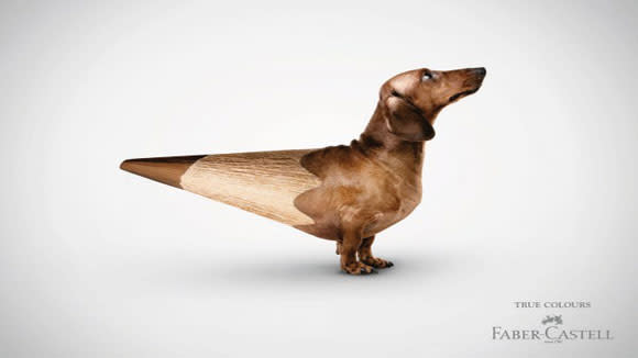
Serviceplan Germany created this awesome print advertising campaign for Faber-Castell. The concept is that you can create any colour from life using the brand's pencils; an idea captured by a pencil literally turning into a range of objects (this little dog, a shark and an aubergine). The slightly freakish nature of the images jars wonderfully with the classic brand aesthetic and ensures viewers take notice.
61. Reading Means Resisting
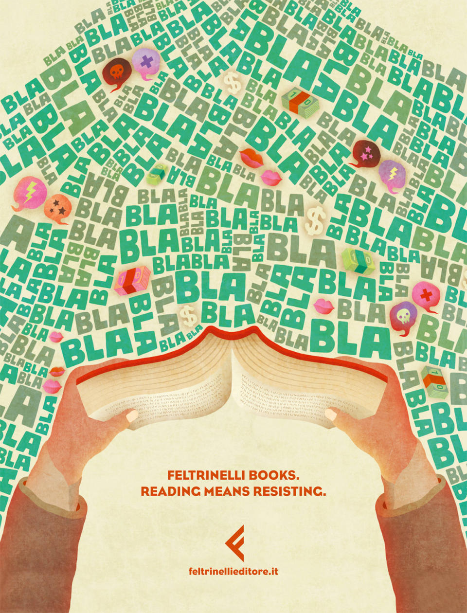
This illustrated print advertisement is designed to promote Feltrinelli books. This tackles head-on the problem people often have with reading: there are just too many distractions around. This sweet illustration goes back to the roots of why reading is great, acknowledging the surrounding distractions but showing how immersing yourself in a book can help shut these out. This campaign was created by Italian advertising agency Tita.
62. Wake Up Hungry
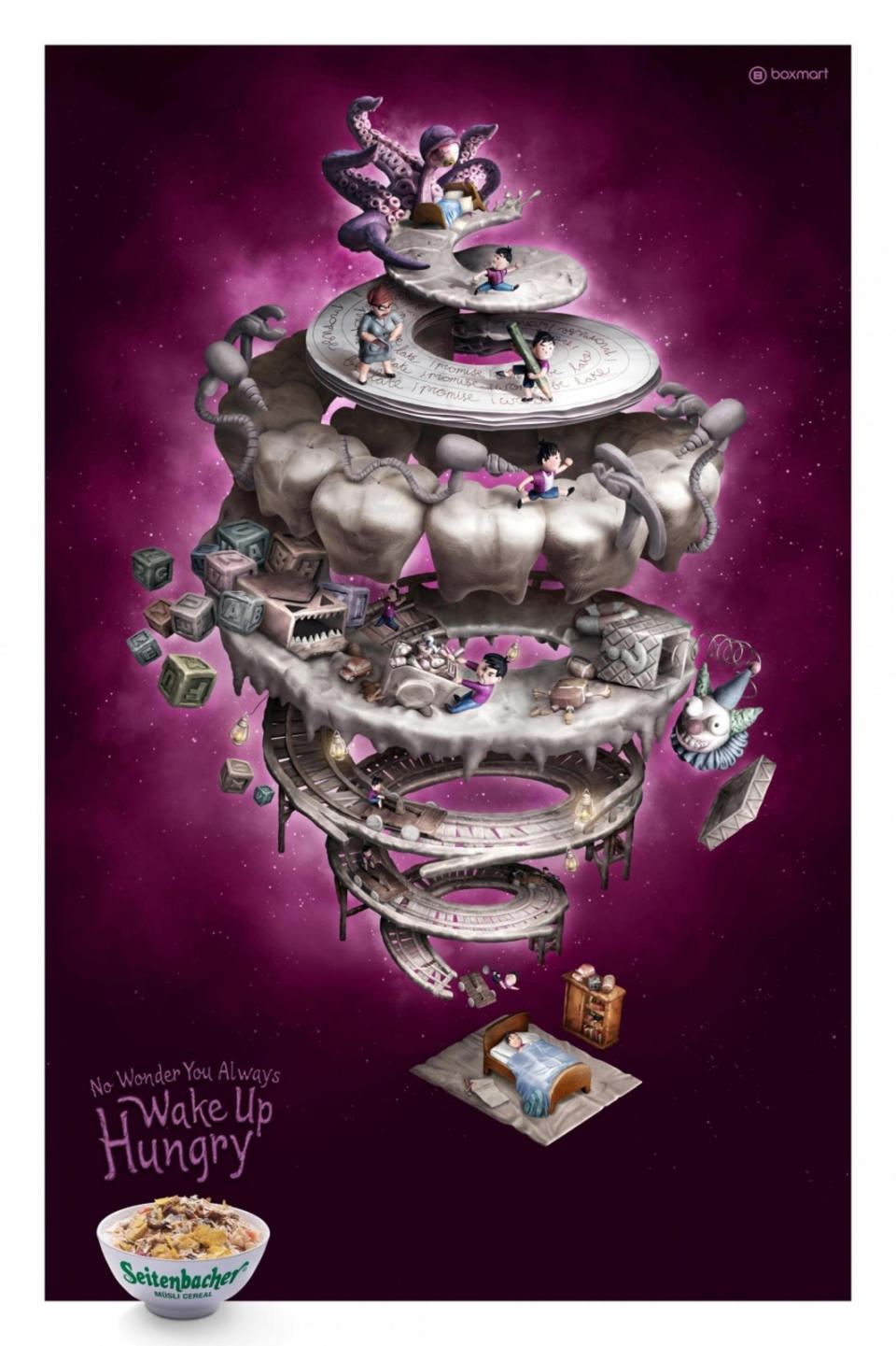
This print ad for a breakfast cereal taps into a universal phenomenon: waking up hungry. It uses an awesome 3D illustration to capture in surreal detail exactly what's gone on during the night, by way of explanation. There are three designs, each tapping into typical dream scenarios: Fear (above) includes scary clowns and dentistry, Commitment features tedious tasks and strict bosses, and Responsibility includes screaming children and a messy house. The campaign was created by JWT Jakarta, with illustrations from Monty Aji Hardito.
63. Jim Rickey

Christian Aslund drew on the spirit of platform games such as Mario for this print advertising campaign for sneaker brand Jim Rickey. The photographer shot the models in awkward horizontal positions on location in the streets of Hong Kong, using a telelens to make the images appear flat and the scenes vertical. The result is full of energy and a serves as a refreshing break from typical sneaker close-ups.
64. Aizone
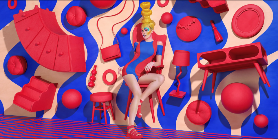
Sagmeister & Walsh has been creating campaigns for Beirut luxury department store brand Aizone since 2010. Early campaigns were mainly black and white, but in recent years the studio has really amped up the colour. The super-bright, surreal scenes of this series of print ads pack a real punch.
65. Buckle Up, Stay Alive
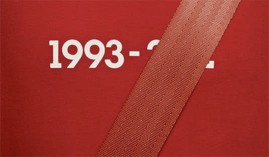
Addressing driving safety is a daunting task for any creative agency. Any ad needs to provoke a strong and lasting impression with an important message whilst still being creatively sound. This campaign from Lg2 for the Quebec Automobile Insurance Society ticks all these boxes and more. This campaign tackles the enduring issue of how to get people to wear a seatbelt. The simple image shows the driver's life dates printed on a car seat, with the latter year of death covered up by the seatbelt. It's a simple but very effective concept.
66. The Guardian US print ad
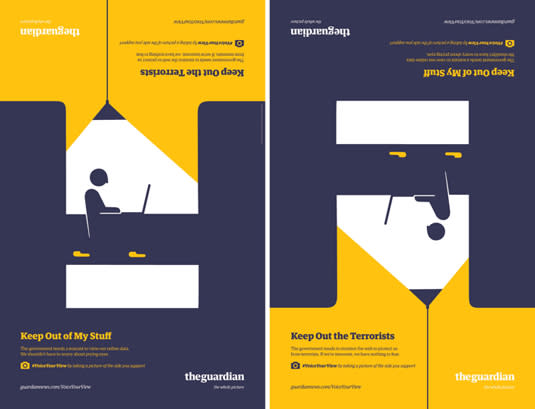
Using illustrations by Noma Bar, these print ads by BBH for the American launch of British newspaper The Guardian depict both sides of core political debates in the US, such as internet privacy, gun control and women in the military (take a look at the full set). Appearing at key locations throughout the country as outdoor ads and mobile billboards, each illustration represents one opinion of the issue. When the poster is flipped, it effortlessly illustrates the opposite view.
67. Exito
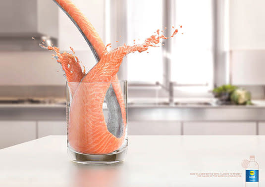
There's nothing quite like a glass of fresh, ice-cold water straight from the fridge. But what happens when that fridge is also housing the leftovers of last night's curry? Or chilling some fish? Flavours can quickly seep into your water. Aware of this, Latin American supermarket Exito developed a special bottle with seven layers, designed to keep other flavours out of your H2O.
In a print campaign to promote the product, advertising agency Sancho BBDO developed this clever series of ads, featuring some of the more pungent things one might keep in the fridge, including salmon and green onions, being poured into water glasses. The effect is satisfyingly unnatural and gag-inducing.
68. Academia do Rock
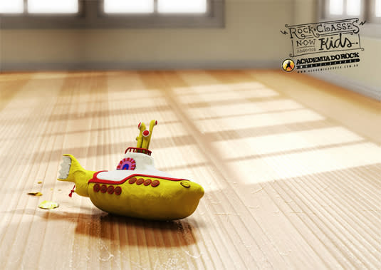
These adorable print ads created by Brazilian based agency Yeah! aim to promote rock classes for kids. The series combines motifs of well-known bands with children's toys and activities. This simple print ad approach is colourfully eye-catching as well as appealing to kids and grown-ups alike. We especially love the Ozzy Osbourne tribute.
69. Sharpie advert
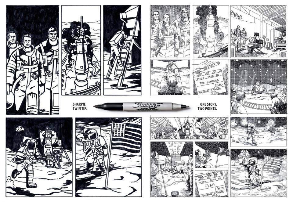
Pen giant Sharpie has produced some marvellous print ads over the years and kept up with design trends galore. Brazilian agency FCB created these clever print ads with the tagline 'One story. Two Points' to promote a new pen with – you guessed it – two points. In turn, the comic art style story captures a major news story from two points of view. We love the comic book execution. Which side will you believe?
70. FedEx
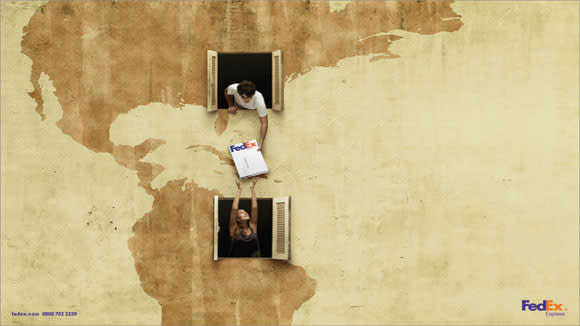
FedEx has run plenty of great campaigns, and we had to include this one in our pick of the best print adverts. It makes the FedEx package the centre of attention without being too in-your-face, and successfully gives a human, friendly face to postal logistics. The campaign was created by DDB.
71. Beck's Art in Progress ads
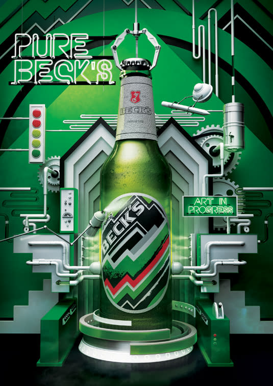
British born, New York-based design studio Vault49 brought its inimitable style to this illustration-led campaign for Beck's beer. Reflecting a growing trend for production-line-style visuals that reflect the creation process, the ad explores the different elements that go into a bottle of Beck's, from an imaginative, conceptual viewpoint.
72. Pantone: Rain Edition
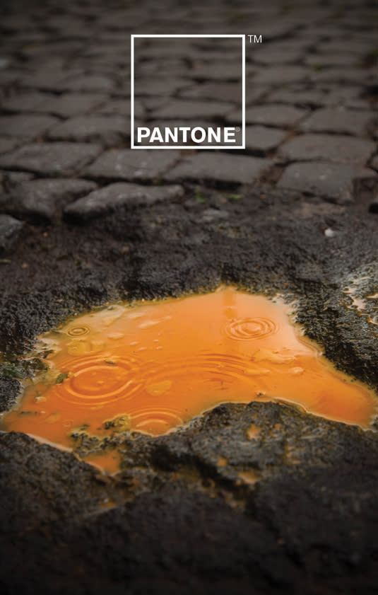
A collaborative effort between Italian creatives Giuliano Lo Re and Matteo Gallinelli, this inspiring campaign for Pantone puts colour front and centre, as you'd expect for the king of special inks. But rather than play the well-worn rainbow card, the duo opted to explore the relationship between colour and water – particularly rainwater.
73. Don't Forget It
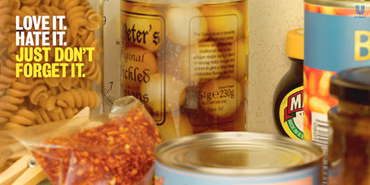
Marmite has developed a reputation for print ads that play on the (delicious) savoury spread's less positive associations. Its ads regularly acknowledge that some people are literally repulsed by its flavour. This print campaign takes on another side of Marmite: the propensity people seem to have to buy a jar and then forget all about it. Adam&EveDDB plays on charity campaign language in these print ads, which aim to 'raise awareness' of woefully neglected Marmite jars across Britain.
74. Hungry Copywriter
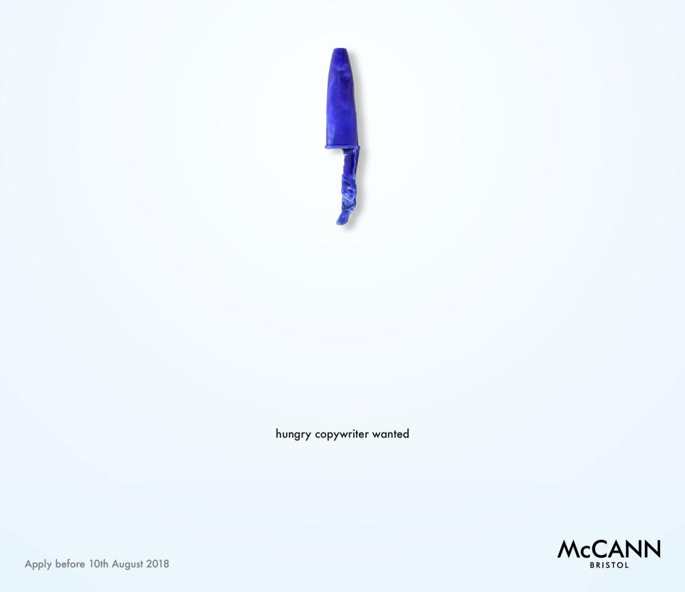
When advertising agency McCann Bristol needed a new copywriter, it did what it does best: advertise for one, and it created one of the best print adverts we've seen in the process. It's no standard job ad. The agency created a striking print ad that included a clever pun, eye-catching layout, and all the information you needed to apply, all in an absolute minimum number of design elements. Incidentally, it also serves as a great lesson in editing for a prospective copywriter.
75. Your Ad Before. Your Ad After
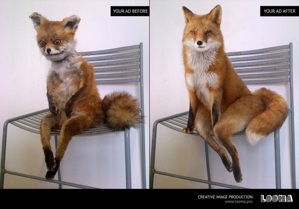
Creative production agency Looma really got to the heart of what advertisement design does in this print ad for itself. Playing the comedy card to great effect, this campaign features a series of before and after shots. As well as a glossy coated version of the famous 'bad taxidermy' fox, this series sees a bad Rocky tattoo get a makeover, and a photo of Steve Buscemi made to look even more gorgeous (take a look here).
76. #FTHEPAYGAP
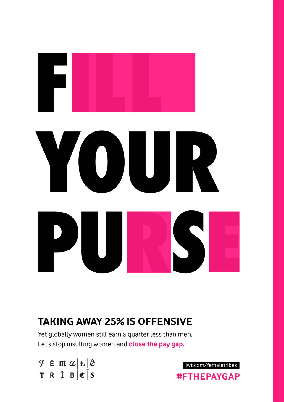
This clever print advert campaign by J. Walter Thompson addresses the pay gap between women and men. The series takes campaign messages and blocks out certain letters to suggest alternate, aggressive phrases – the message being that choosing to pay female members of your workforce significantly less than their male counterparts is just as offensive as other, more obviously sexist behaviours. The ads form part of JWT's Female Tribes campaign to change the cultural narrative around women.
For more advertising inspiration, take a look at the genius Greenpeace ad that's a must watch for Succession fans. If you're after some marvelous marketing examples, look no further than our collection of the weirdest, cringiest and funniest Super Bowl ads of 2024.
