71 Charts That Will Teach You So, So, So, So, So Much Interesting Stuff
1.This chart shows how much money one person needs to make to live comfortably in each US state...and yeah, things have gotten expensive.

2.To drive home just how expensive things have gotten, look at this chart showing fast-food inflation over the last decade.

3.If you're being honest, you're probably a little foggy on the difference between a second cousin and a first cousin once removed. This napkin explains it all!

4.Depending on where you live in the States, you either say "soda," "pop," or "Coke" (as a lifelong Californian, I say "soda"). Check out who says what and where.

5.Here are the highest-grossing music tours of all-time through the end of last year (Taylor's tour has only added to the lead since then).

6.This important chart tells you how you can know when someone has spiked (or otherwise tampered with) your drink.

7.This chart has some terrific advice on how to stay calm (and let's be real...we ALL need this right now).

8.And this chart will help you pick the safest swimsuit possible depending on whether you're hitting the lake or pool (black in the pool is a good choice...not so much at the lake).

9.I have one of the least common birthdays on this list (Let's f'ing go. Let's go. I guess.) What about yours?

10.This chart tells you some of the biggest red flags to watch out for when interviewing for a job (including the old "we're like a family" oof).

11.Someone needs to send this chart to Leo to help him see his dating life is getting more than a tad awkward.

It's like, no, Leo, there isn't room next to the 20-year-old on the floating door! You're almost 50!
12.Here's where you can find national parks in the USA, and it's interesting to see how some states have a lot, and some have none at all.

13.And this chart shows you the most popular fast-food chains in each state (and I'm only learning about Burgerville, Dick's, and Culver's from this!).

14.If you've ever wondered how to define bullying (as opposed to just folks being rude or mean) this one is for you.

15.This chart from the Holocaust Museum explains the early signs of fascism and — looks around at 2024 — yeah.

16.This chart of Japanese emoticons (used throughout much of Asia too) is so cute...and I guess I'll be using these now?

17.This chart explaining how airlines make their money through seating is super interesting.

18.7-Up "never had it, never will," but these other drinks range from having a little caffeine to a LOT.

19.College costs more than ever these days...here are some majors you might want to reconsider.

20.Cats are enigmatic...this chart will help you understand them.

21.This data is a few years old, but something you might want to consider when buying a car (if you don't want to be conspicuous in the eyes of police).

22.And — for you history fans — this map shows the route the Lewis and Clark Expedition took.

23.This one will tell you the names of common things you probably don't know (like that illegible handwriting is called a griffonage).

24.This chart shows the progression of World Cup soccer balls from 1930 to the modern day.

25.OK, I did NOT know this — India has wildly different drinking age rules, ranging from as young as 18 in some spots...to a total drinking ban in others.

26.If you've ever wondered where all the 8 billion people in the world live, this chart breaks it down for you.

27.This card (found in a deck of cards) explains all the hands you can have in poker.

28.This chart shows the very different benefits of taking a cold vs. hot shower.

29.This chart shows what you do and DON'T want to do if you get bitten by a snake.

30.This chart shows plants that are hard to kill (which probably makes them ideal for your home, lol).

31.This chart tells us which countries have more males or females — and YIKES straight men in Qatar better learn some good pickup lines or buy a new shirt or something as only 24.85% of the population is female.

32.This chart shows you how much alcohol Americans drink, and whoa — 24 million of us average 10+ drinks per day.

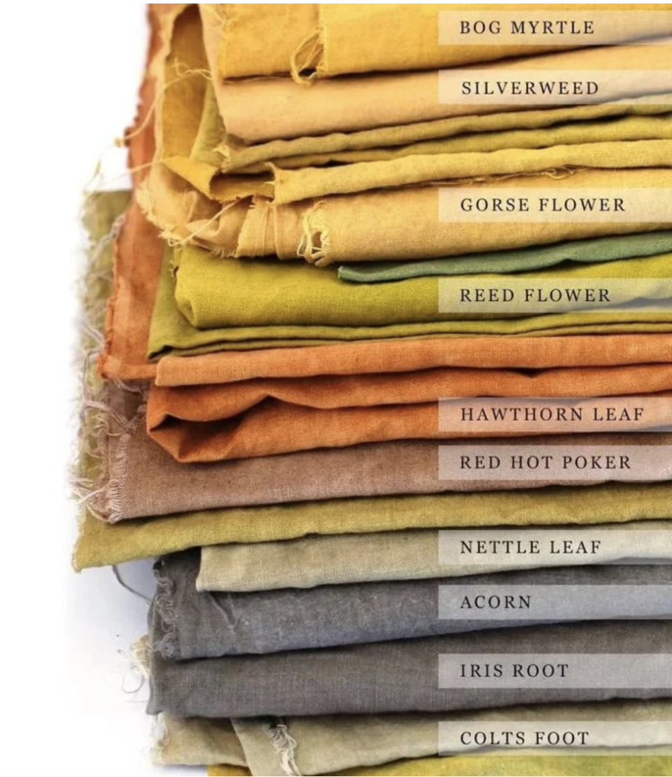
33.And this fascinating chart shows you the typical colors of clothes during the Middle Ages...and the natural dyes people used to create them!
34.Speaking of clothes, here's how often you should be washing yours.

35.Nuclear mushroom clouds can be so much more staggeringly large than you likely realized.

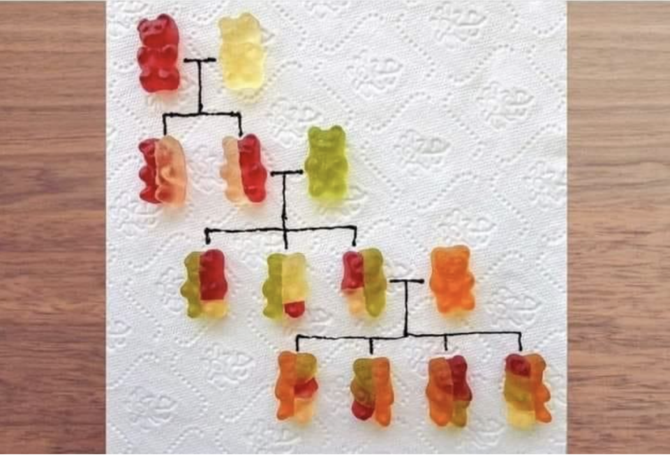
36.This ingenious image does a great job of explaining how genetics work...and making you crave gummy bears.
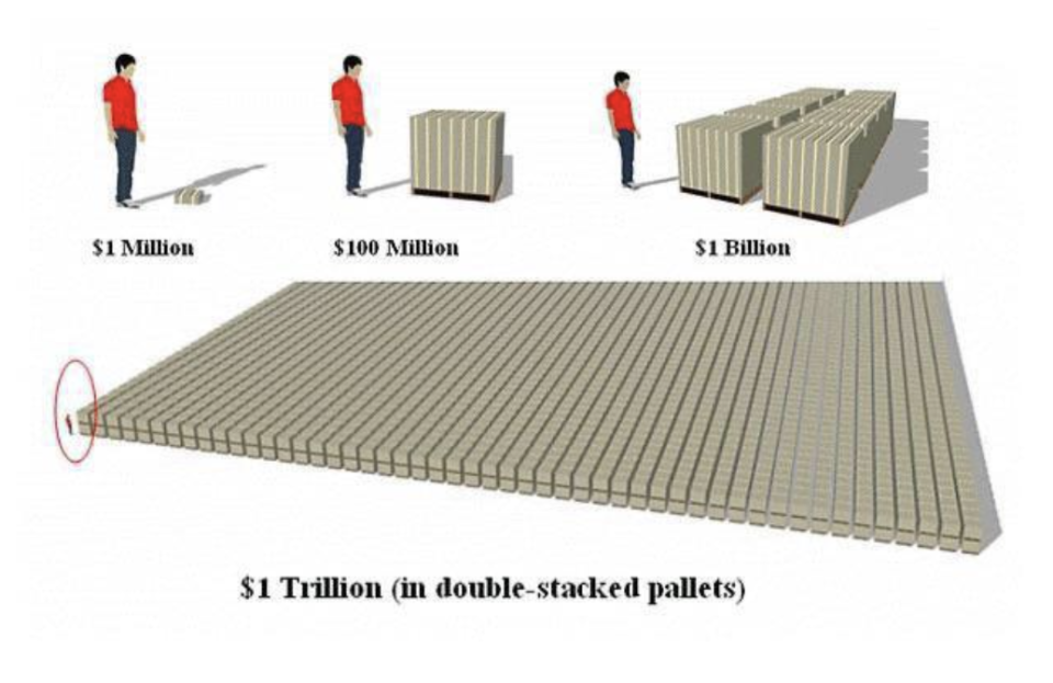
37.And this chart shows you just how unfathomably large a trillion dollars is.
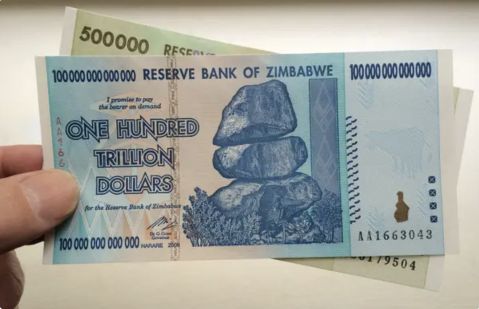
Speaking of a trillion...this fact is wild. Hyperinflation hit Zimbabwe so heavily in 2009 (inflation literally reached 230,000,000% that year!!!) that the country introduced a 100 TRILLION dollar bill...which was worth about 40 US cents.
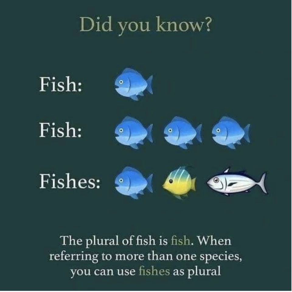
38."Fishes" CAN be the plural form of "fish." Little kids everywhere are vindicated!
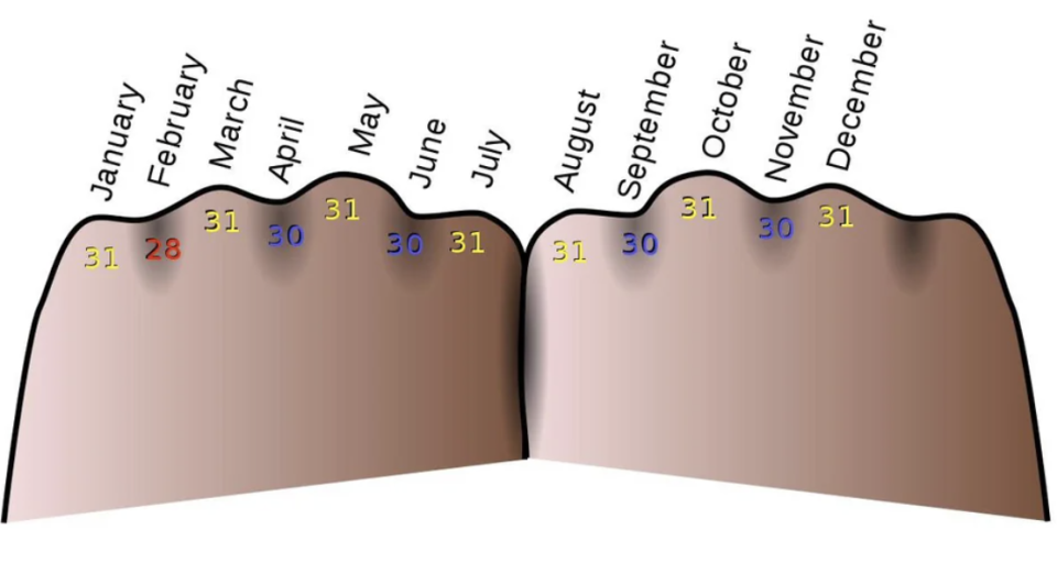
39.This chart shows a trick for remembering how many days are in each month (the "knuckles" months are the ones with 31 days).
40.Speaking of eye sight, babies don't just pop out with fully developed vision. ... It's a gradual process.

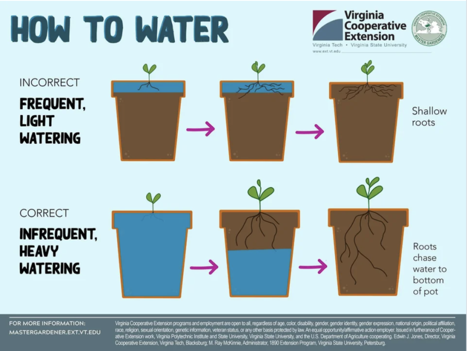
41.This chart explains how we've all been watering our plants the wrong way.
42.This incredible image shows just how much a cervix can dilate during childbirth.

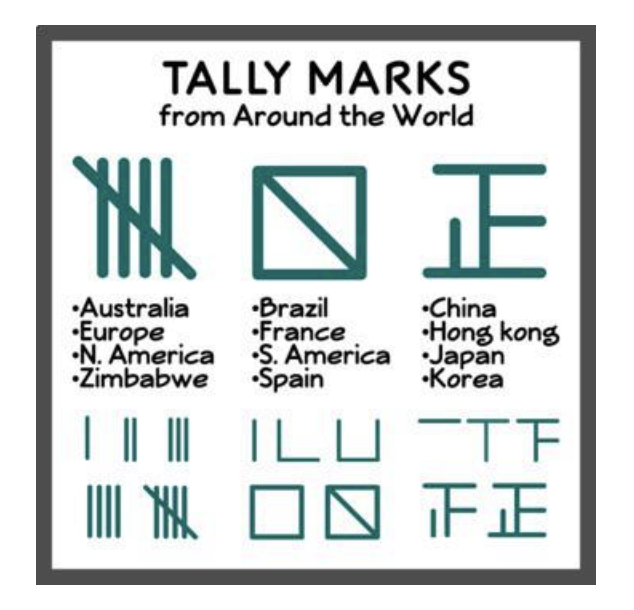
43.And this chart shows people draw tally marks differently depending on where they are in the world. Huh.
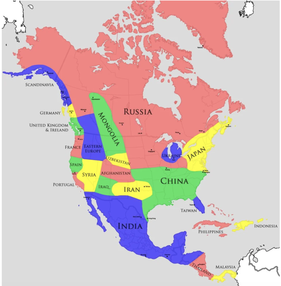
44.This US map chart explains that the American Southwest's climate is like the Middle East's, and Washington's is like England's!
45.And Los Angeles County has a greater population than 40 actual states!
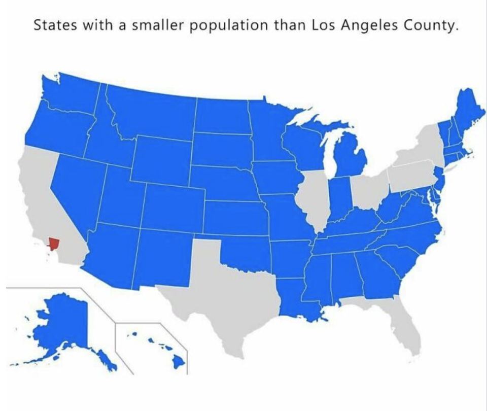
This graphic, I think, is a little off. It shows only seven states with larger populations than Los Angeles County, but — according to the 2020 census — there are 10 states with more than Los Angeles County's 10.04 million residents (California, Texas, Florida, New York, Pennsylvania, Illinois, Ohio, Georgia, North Carolina, and Michigan).
Still...I never would've imagined that!!!! Time to apply for statehood, Los Angeles, LOL!
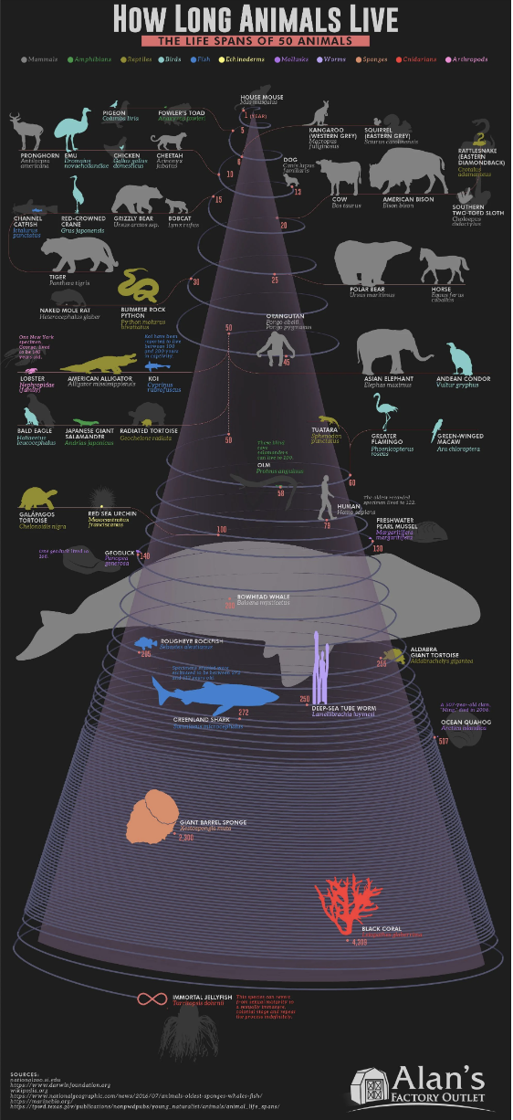
46.There's a type of jellyfish that's — wait for it — immortal. Known as the Immortal Jellyfish, the species (as the chart says) "can revert from sexual maturity to a sexually immature, colonial stage and repeat the process indefinitely."
47.You can do the Heimlich Maneuver on a choking dog and save their life.

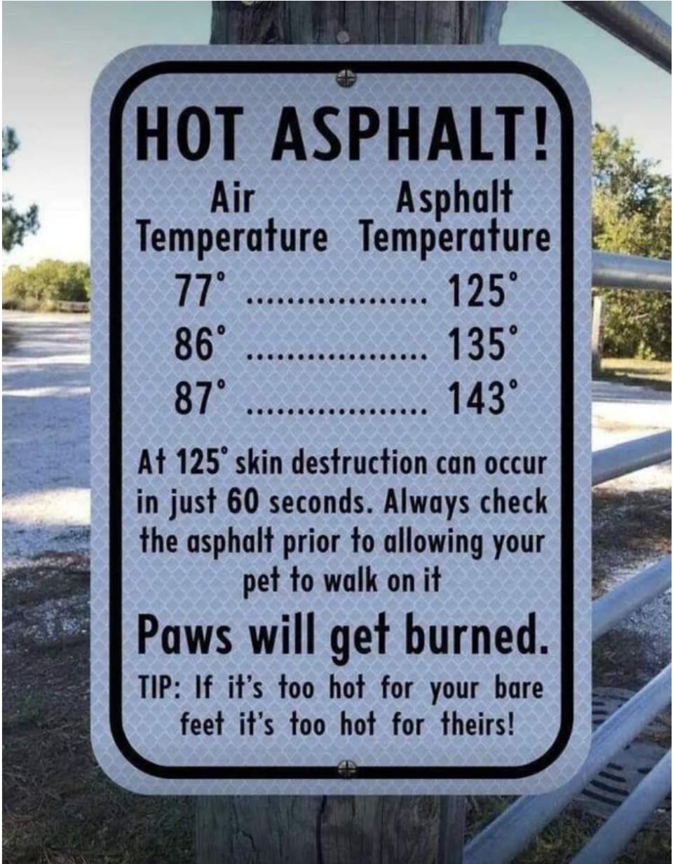
48.And, speaking of dogs, the asphalt your pup walks on is probably way hotter than you realized.
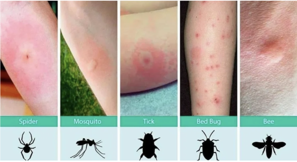
49.This chart shows how you can figure out what bug did you dirty just by looking at your bite.
50.And, while things are pretty secretive in North Korea, it appears this wild fact is (or at least was) true — their professional basketball league has their own rules, including dunks being worth three points!

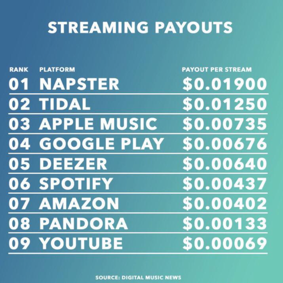
51.You've probably heard streaming makes it really hard for a musician to make a living, but this chart shows just how dire a situation it is!
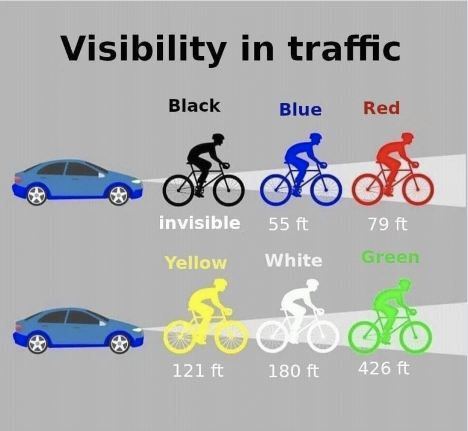
52.What you wear running or riding a bike at night makes a shockingly HUGE difference in how visible you are.
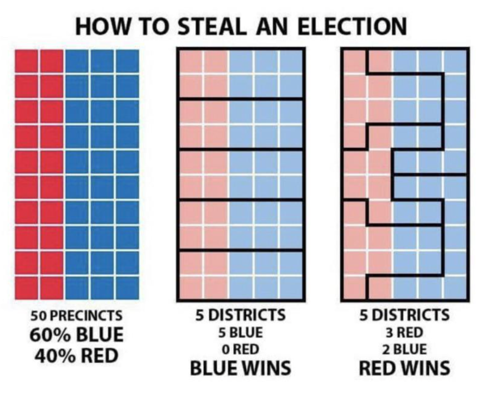
53.And this graphic explains how gerrymandering works in simple terms...so we can all understand how infuriating it is!
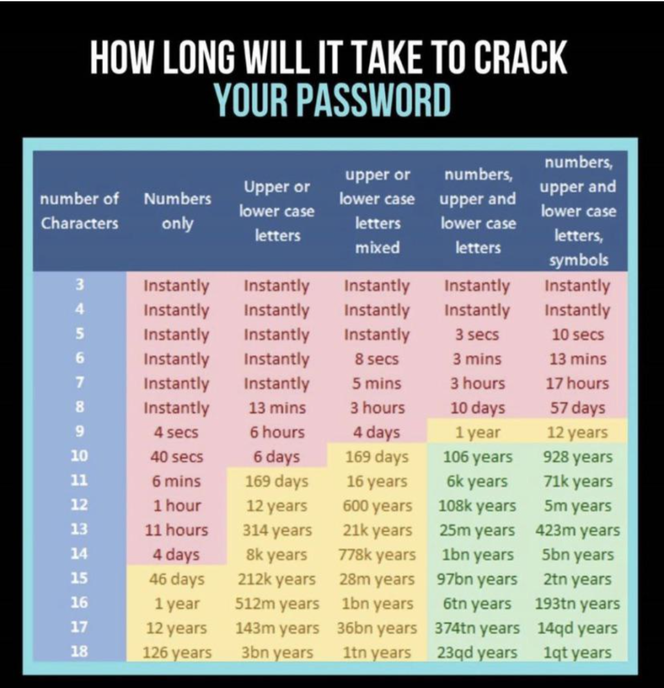
54.Hackers can crack a so-so password instantly, but a really strong one can take millions (yes, millions) of years to crack.
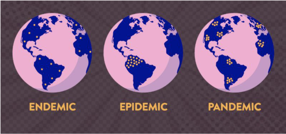
55.This is the differences between endemic, epidemic, and pandemic...explained in the simplest way possible.
56.And this card (found in a deck of cards) explains all the hands you can have in poker.

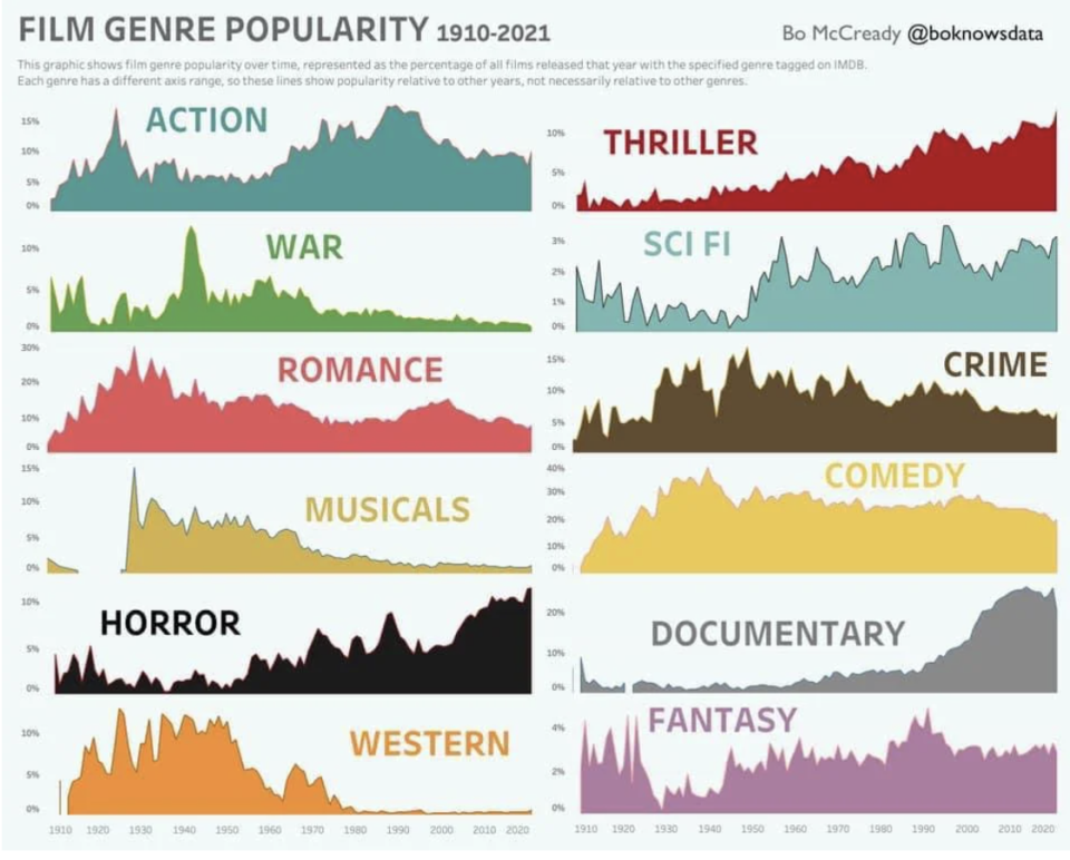
57.If you love movies, this chart is FASCINATING.
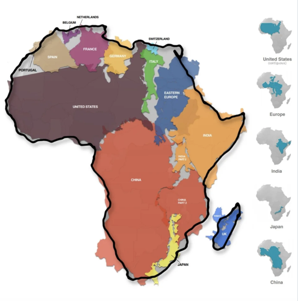
58.And I knew Africa was big but not THIS BIG!
59.This cool chart shows you 16 — yes, 16! — different sizes of mattresses.

And if you're wondering what the heck an Alaskan King looks like in person...well, here's one.

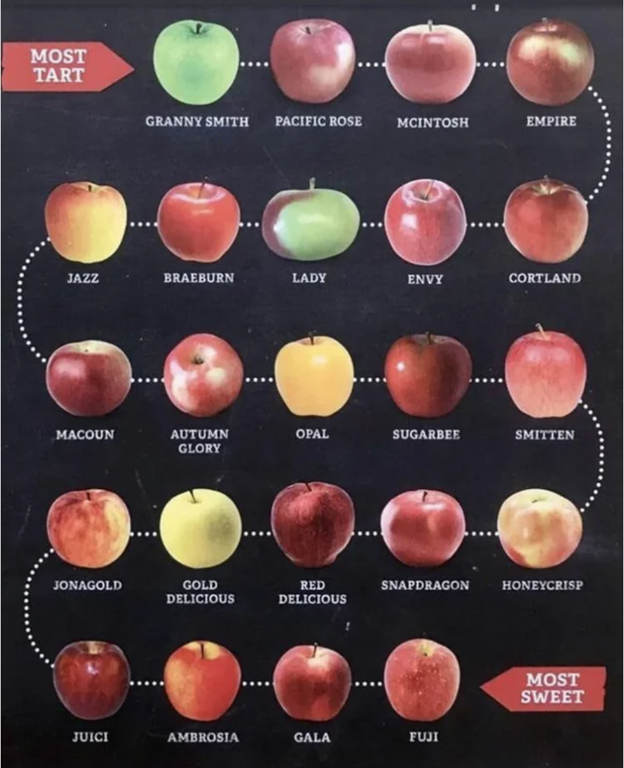
60.This chart shows apples on a scale from most tart to most sweet.
61.Ever wonder what the exact differences are between the ways you can cook a steak? This chart's for you.

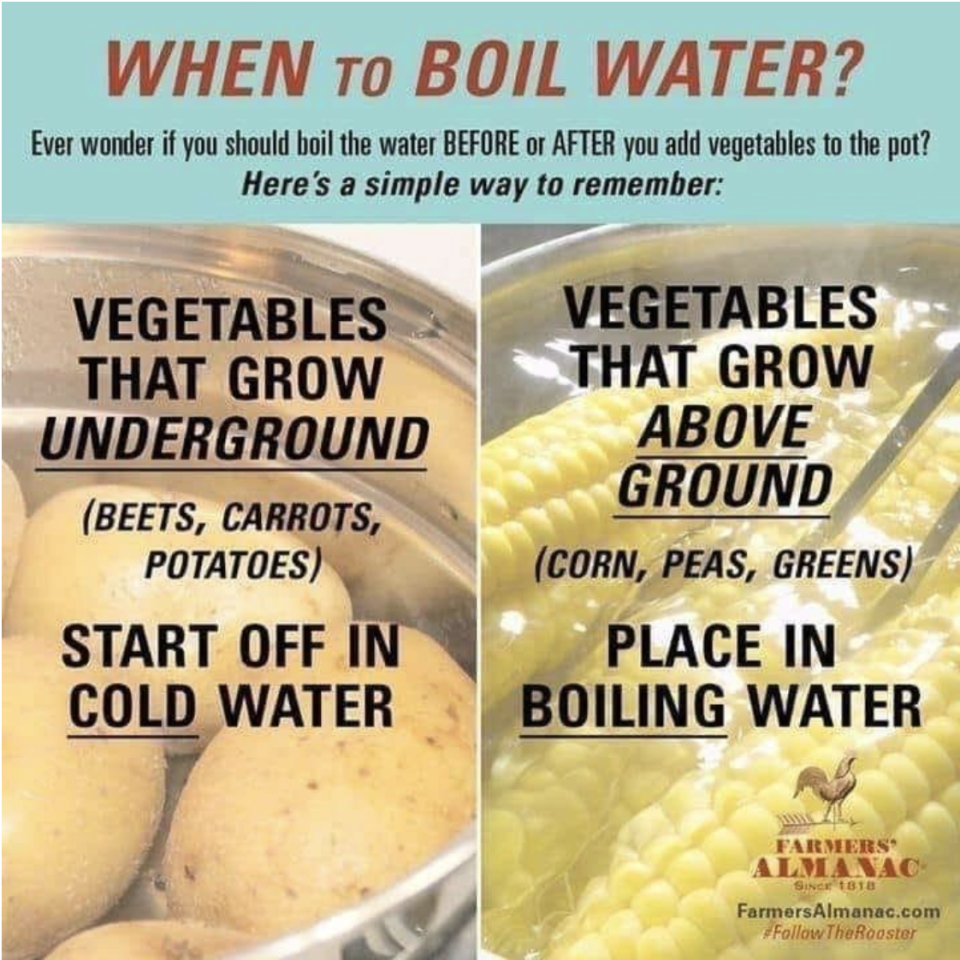
62.And if you've ever wondered, "Wait...do I put the veggies in the water before or after I boil it?" Well, this chart's for you, too.
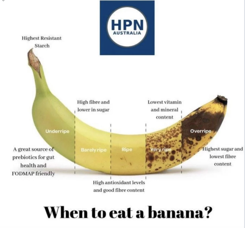
63.This chart explains when you should eat a banana (and has me rethinking my whole life...or at least when I eat bananas).
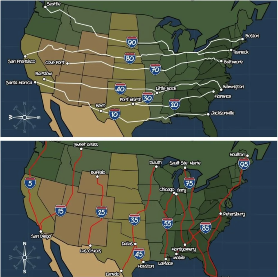
64.Get this — the numbers used for our Interstate Highway System aren't random...they all mean something specific.
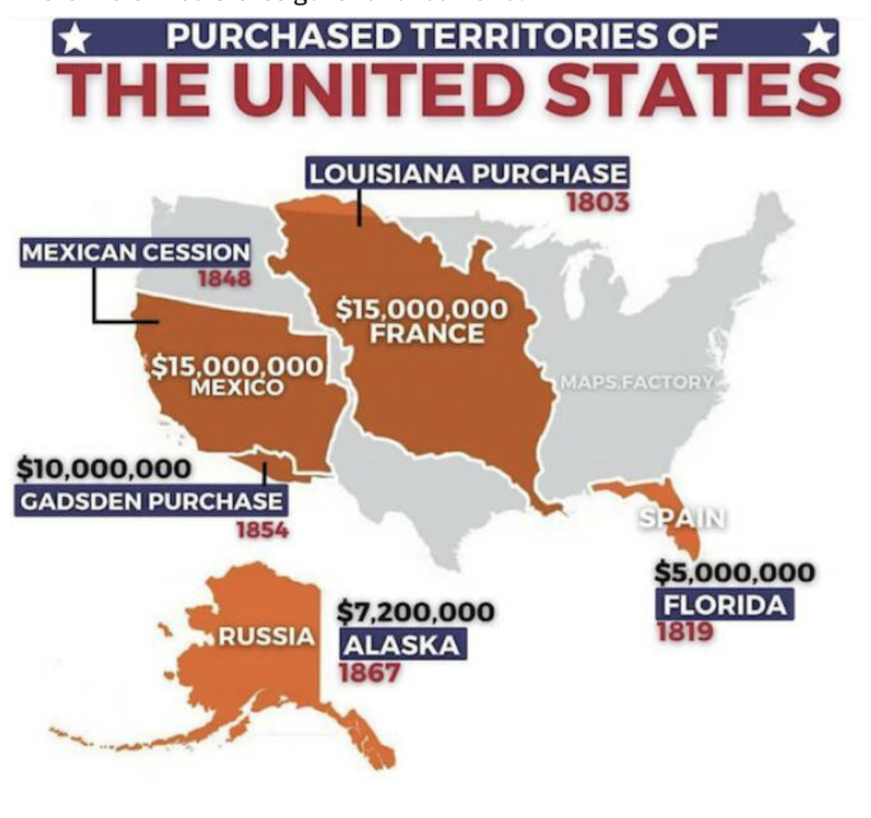
65.Also fascinating? This map that has the deets behind the territories the United States purchased.
66.This map shows life expectancy in the different counties throughout the USA — looks like the Upper Midwest is a good place to go if you want to live a while!

Want to search life expectancy by country, state, or zip code? Do it here.
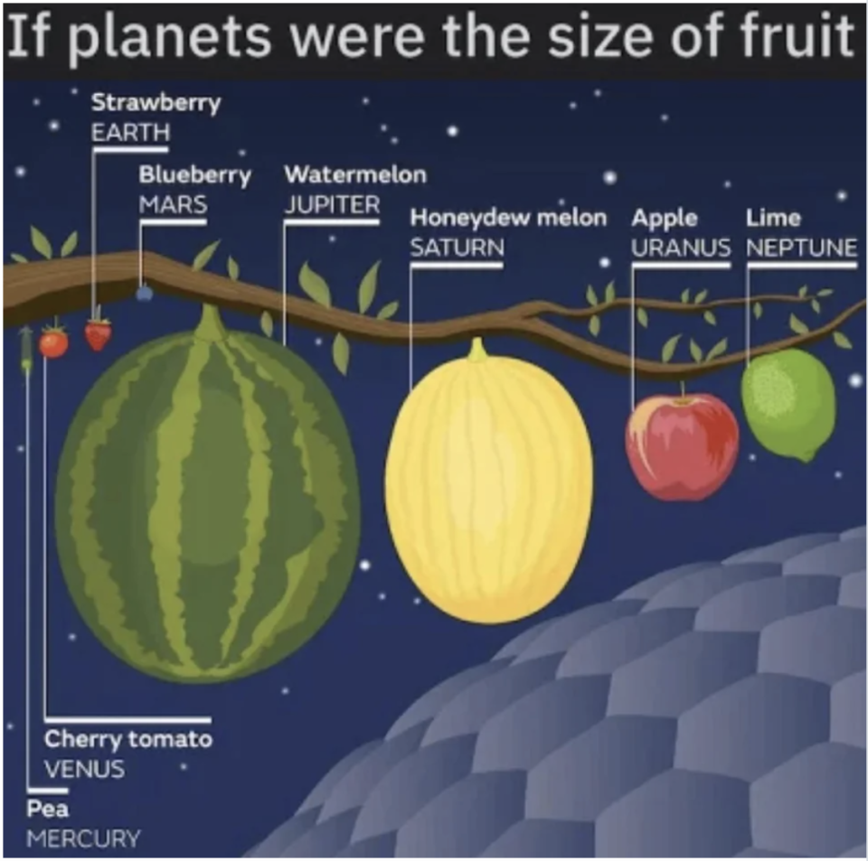
67.This super-cool chart spells out just how vastly different the planets are in our solar system...using fruit.
68.This sobering chart shows just how despicable these absolute monsters were.
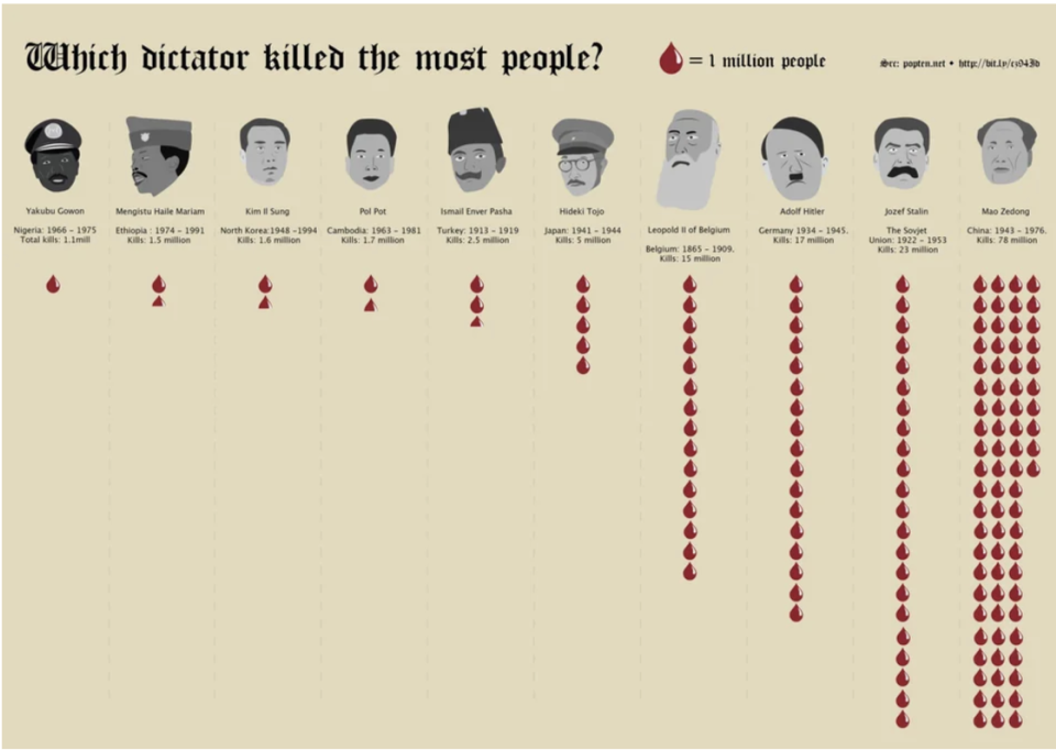
So, how did Mao Zedong — the chairman of the Chinese Communist Party from 1943–1976 — kill so many people? A big part of it was due to his Great Leap Forward program, which aimed to turn China from an agrarian nation into an industrialized one...fast. Way too fast. As a result, as many as 45 million starved, fueled by Mao's refusal to acknowledge what was happening or to accept international aid.

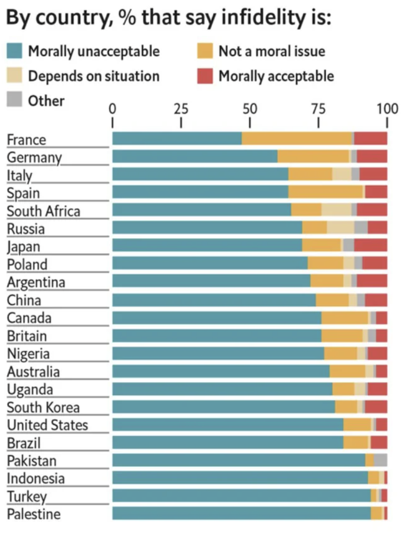
69.This chart shows a ranking of countries based on how accepting they are of infidelity.
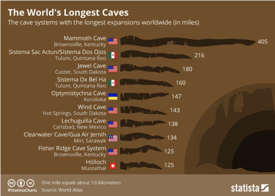
70.This chart explains what the world's largest caves are (Kentucky's Mammoth Cave is indeed MAMMOTH).
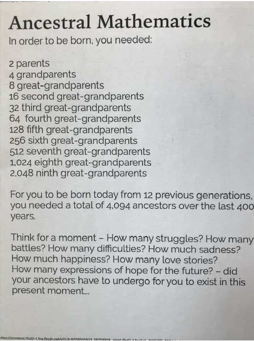
71.And lastly, this deep thought should inspire you to stop and reflect on your place in it all, and maybe feel a little gratitude.
HT: r/coolguides
